Cross-Stressing

SwtJust lately I finished up Marvel: Ultimate Alliance and picked up Lego Star Wars II. Despite the fact that my 7-year old nephew is playing the same game, I gotta tell you it’s a hoot and a half.

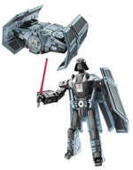
So I was mildly interested when I saw that a Lego Batman title is in the works, but at the same time, I’m disturbed by all this cross-branding as of late. (Star Wars Transformers?! Yeesh!)

Taking the associated brands into a video game seems barely acceptable, but you just know that Lego Batman Tansformers are around the bend. Or Teenage Mutant Ninja GI Spider-Joes. How about Simpsons Lincoln Log Monopoly?

The whole trend just screams “hey America, we’re all out of ideas! But we’d love it if you kept buying our crap!”

I say once we hit “three, three, three brands in one!,” it’s officially time to move to Sweden.

Technorati Tags: , ,

Amazon’s Emetrics Don’t Suck

AmazonOK, first off this data is at least three years old, but I still think it’s fascinating.

I ran across it at Web Pages That Suck (I looked for a permalink, but couldn’t find one.  Look for "When Simple Design Doesn’t Work").  It’s a PDF of an Amazon.com presentation from 2004 that discusses, among other things, Amazon’s A/B testing.

There’s some great examples starting on page 14 showing differences in their top navigation tabs, a scaled tab that never was, and, the most interesting part for me, a look at simpler pages vs. more crowded pages.

Now, if you believe the current Web 2.0 trends, which I like from a design standpoint, you’d think more "white space" and less crowding would be more attractive and, hence, more profitable.

Well, it turns out that for a retailer like Amazon with lots to browse and recommend, more is better.  Cart adds were down and abandonment was up.

Amazon is well known for leaving nothing to chance, and letting the numbers speak for themselves, so, looking back at my own redesign, I’m really glad I looked closely at how they organized their home page.

I’d love to do some intensive A/B testing when time and budget allows.  Not only would it yield some interesting results, I think it’d just plain be a lot of fun.

Anyway, check it out.  It’s pretty fascinating.

Technorati Tags: , ,

Brevity Is…

It’s funny how cartoons change.

I keep a box next to my drafting table full of slips of paper with ideas.  I don’t draw anything on them, they’re just covered with gags.

A standard page usually has three or four hastily scratched jokes, and they marinate in the box for a while until I pick three at random to draw up.

What’s weird is how a gag I haven’t looked at in months all of a sudden becomes immediately clearer to me; the shortcomings instantaneously apparent, as is the probable solution.

Here’s an example:

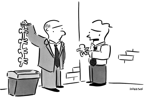
writing cartoons

The original caption:

“Listen, I don’t wanna use the shredder.  Frankie don’t wanna use the shredder.  But you gotta tell me what I wanna know right now or they’re gonna get the shredder!”

I’d considered adding some sorta swear words for emphasis…

“…or they’re gonna get the Goddamn shredder!”

“…or they’re gonna get the freakin’ shredder!”

…but the whole thing just reeked of trying too hard.

The amended caption:

“Just tell me what I wanna know!”

Not bad, but still pretty weak.

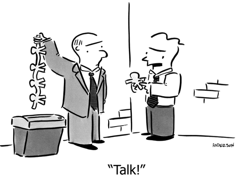
The final caption:

writing cartoons 2

Ahhh…  There it is.

Not that shorter is always better; sometimes a wordy caption is perfect, but not this time.

Anyway, it’s weird how it works.  I knew immediately that the original caption sucked (although when I originally wrote it, it seemed perfect), and the amended caption came right away, but the one-word caption occurred as I was inking it, which is later than normal, but you learn to just accept gags when and how they happen.

That’s really the fun part for me; that “ah-HA!” moment.  The daydreaming and digging for gags.  It’s the hardest part, but the most rewarding.

Plus I get to draw a strip of paper people about to be shredded by mobsters.  That’s fun too.

Andertoons 2.0 – New Filemaker Database

I love Filemaker.

I think the common conception of the artist is one surrounded by various piles of slovenly creativity.

Not me.  I’m a neat freak.  (OK, I leave dirty clothes next to the hamper in my bedroom, but that’s another blog…)  I revel in being able to take gobs of information and organize it into tables and layouts and such. 

So getting to design a new Filemaker database to match the data structure of the new Andertoons?  Heaven.

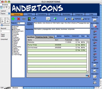
Here’s my old FM layout (click to enlarge):

Olddb

Not too bad for my first try, and it served me well for years.

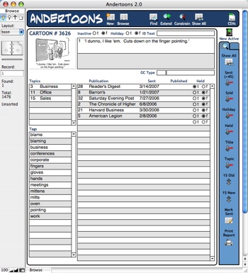
But here’s my new digs (again, click to enlarge):

Db2


Oh yeah…  That’s nice!

With Fliemaker 8.5, I can now pull the thumbnail from my site and see it live in the database instead of adding thousands of JPEGs to the database itself.

And each tag now has its own entry, instead of being a single field filled with comma-separated keywords.  (Notice how they alphabetize themselves?  JOY!)

I’ve also added some new buttons for myself at the top and side to speed repetitive tasks.

Everything I need at a glance.  And fun little icons to boot!

I’m such a nerd.

Technorati Tags: , , , ,