
Two years ago I was still early on in my blogging, and I was doing a fair amount of movie reviews. So, when Christmas came, I hit our public library and checked out a bunch of holiday-themed cartoons. I think I did about one a week.
After posting a review, I’d also post it over at BlogCritics. It was still young then, and I still had lots of time to post elsewhere often.
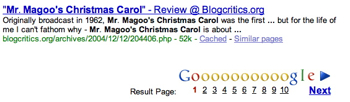
Anyway, I posted a bad… OK, horrible… OK, really horrible review of the 1962 “Mr. Magoo’s Christmas Carol.” (You can read it here.)
I took a lot of flak for it over at BlogCritics, and, to be fair, “I can see myself walloping Tiny Tim with his own cane” was a tad strong. But what’s surprised me the most is how this review comes back to haunt me each Christmas season (the review ranks #10 on Google). Talk about Dickensian!
Some of favorite comments include:
…no amount of “Bah, humbug” from you will tarnish my memories and enjoyment of this wonderful musical “that I will cherish all my days.
Anderson you’re a pompous fool… relive your childhood like Magoo did,
and btw, learn to draw.“RAZZLEBERRY DRESSING”! Go ahead and scream.
I responded to each for a while, and, again, to be fair, I sort of fanned the flames. However, I don’t understand how this response from me…
See that’s the great thing about a blog reviews vs. your standard newspaper/tv/whatever review – dialogue!
…garnered this from the original commenter almost a year later:
Wow! Just got a chance to read your comment to my response. I admire your sparkling comeback — what a gem. The proficiency of your verbal skills is only exceeded by your extraordinary drawing skills. Simply brilliant!
Yeesh!
This year I finally got a comment on my original blog here.
You may be alone in your comments about the Magoo Christmas Carol. The musical score is much superior to the majority of future Xmas show specials like Santa Claus is coming to Town, Frosty the Snowman. Only Rudolph can be counted as an equal.
No, Magoo isn’t Magoo. But the songs are moving, catchy, original and highly acclaimed. It is a feel good program, not filled with sexual innuendos or poor tasteless jokes. Most who remember this appreciate the simple fact that it is what it is.
So not only am I wrong, but apparently I can only enjoy a Christmas cartoon if everyone in it is farting while having sex.
OK, here’s the deal – I didn’t grow up watching this, so I don’t have any fond memories to color my review. In fact, I’d never heard of this until the librarian suggested it.
My review is unabashedly a bashing of an older film, and maybe that’s not fair, but just because it’s some 40 years old and a Christmas film to boot doesn’t mean it’s good either.
I’m no animation aficionado, and I’ll be the first to admit that my silly little cartoons pale in comparison to even the Magoo legacy, but good lord people, lighten up.
Technorati Tags: andertoons, animation, cartooning, cartoonists, cartoons, movies


 Hey, there’s a super nice