
OK, I’m still working on the new site design, and I’m starting the little graphics for the left navigation buttons.
Cartoon compatriot Mike Lynch uses a limited palette now and again, and I thought these graphics might be a good place to try that. Plus I’m wondering if I shouldn’t keep closer to the site’s colors. (Again, I’m woefully color challenged.)
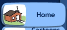
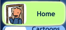
So, here’s some looks at the first button’s resting state:
Full color
Limited color
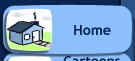
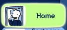
And it’s rollover state:
Full color
Limited color
Any strong thoughts one way or another?
Technorati Tags: andertoons, cartooning, cartoonists, cartoons, websites
Well, I know this probably isn't what you want to hear…but I actually like the old site design better. I think it has more breathing room. The new design uses up virtually every square inch of empty space (especially with the enlarged menu buttons and the expanded "Andertoons" logo at the top) so it almost feels a little too busy. I'm also sorry to see the waving guy go–it's the first thing you notice when landing on the site. But maybe you don't want him to be the first thing people notice!
I do think it's a good move to get rid of the triangle in the upper right hand corner of the old site.
As for color, I agree that the site design ought to have a limited palette (again, to avoid being too busy), but I don't know that I'd take color away from the menu cartoon figures. They ought to stand out a little.
I'm certainly no design expert, just giving you my impressions. In the end, go with whatever you're happy with!
Hey Angie!
I agree with you on the Andertoons logo. I've been trying to decide if that was too big…
I'm sorry to lose the waving guy too, but over the years my style has moved away from him a bit.
I considered designing another from scratch, but for space concerns, and future style concerns, he had to go.
Now about the left buttons… Too big you think?
Oh… Also, I agree with you on the little graphics. My wife does too. She saw my blog entry over my shoulder and immediately said "the full color for sure!"
I was looking over your other shoulder and came to the same conclusion. Full color. And as I said earlier, I like the new site design.
OK, full color it is. And I'm glad the new look is meeting with positive reviews overall!
i like "home" in full colour
Wait til you see the buttons! They're really turning out nicely!