OK, I know I said I was done with this, but I still felt that some cleaning at everyone’s favorite cartoon site was necessary.
I really took to heart everyone’s comments, and I think you’ll like this.
Behold:
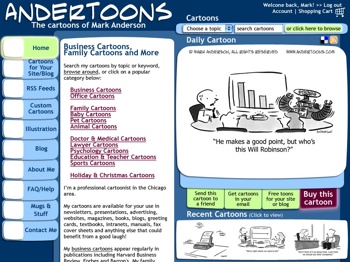
(Click the image to see it at 800 x 600)
I think it keeps the flavor and overall design of the original site…
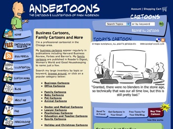
(Again, click the image to see it at 800 x 600)
…while tightening things up and allowing for some small changes. (BTW, this will all go down sometime in mid January, so enjoy the current site while you can.)
I got rid of the waving/blinking guy (sorry), and the cartoon search triangle, which allowed me to fit a lot more in 800 x 600 before scrolling.
I kept the left navigation buttons, and actually enlarged them. No art for the left of the buttons yet, but that’s coming.
The big box o’ text is now a bright white to make things more readable, and recent cartoons got bumped up to a more prominent position.
Also, I tried to unify the design by utilizing a slightly rounded rectangular shape wherever possible, ass opposed to mixing odd shapes in the last design.
I also stuck to only web safe colors, so there’s some subtle changes in color overall.
One more thing – when you rollover the buttons, they’ll now appear to light up. (Check out the “Buy this cartoon” for an example.)
I’m really pleased with the end result. It’s still familiar, but freshened up, and it’ll allow me a lot more flexibility in content placement down the road.
Anyway, let me know what you think. Hope you like it!
Technorati Tags: andertoons, cartooning, cartoonists, cartoons, websites

