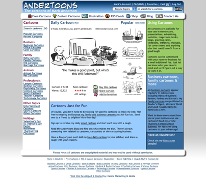
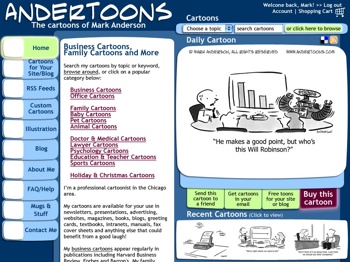
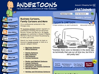
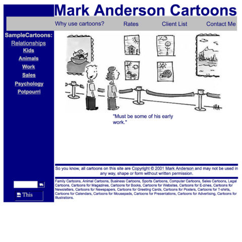
The History of Andertoons.com

When I was just starting out as a cartoonist almost 20 years ago, I was photocopying my cartoons at Kinkos, stuffing them in envelopes with a SASE, keeping track of my submissions in a spiral notebook, and watching the mailbox like a hawk.

A few years later I thought there might be an opportunity to sell my cartoons on the relatively new World Wide Web and I built the first Andertoons.com. It was a game changer.

Instead of sending out stacks of mail, people found and emailed me. Instead of weekly photocopying, I scanned in my cartoons one time. And instead of invoicing and waiting for checks, revenue went into my bank account everyday automatically. It didn’t take long to see that this was the way to do business.

Over the years Andertoons.com has changed and evolved in ways large and small, so with launching the new site, I thought I’d share some of the old Andertoons. Enjoy!

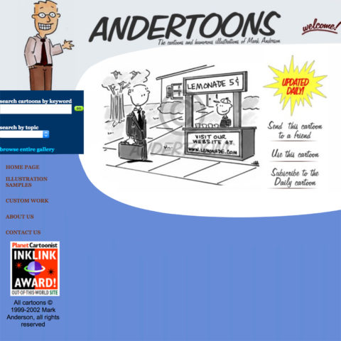
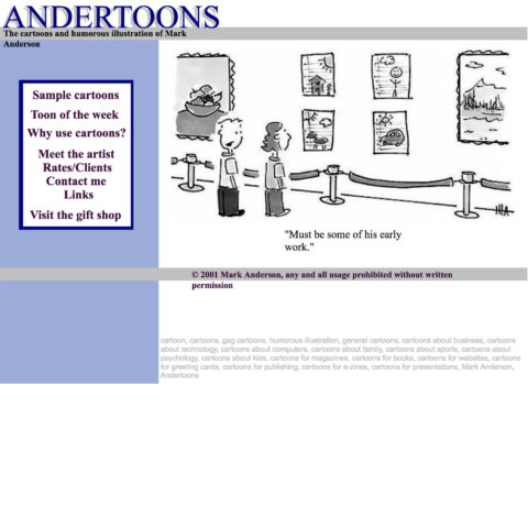
2001 – I built this myself using a WYSIWYG service.
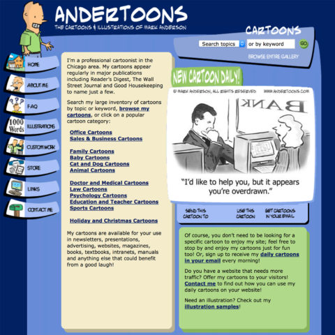
2002 – Some WYSIWYG refinements.
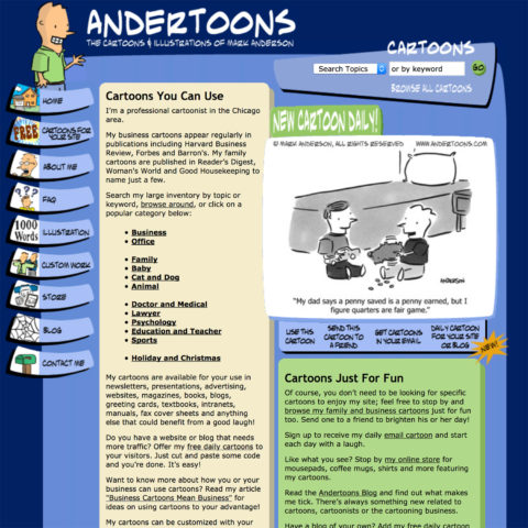
2003 – I hired my first designer/developer.
2004 – I began working with a developer I’d continue with for almost 14 years. And the Andertoons font debuts.
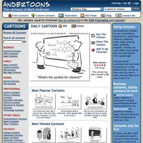
2005 – Minor changes including a blog widget.
2007 – The last time I did the design myself. I should have stopped earlier.
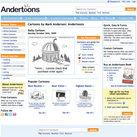
2009 – A more modern Andertoons with a new logo.
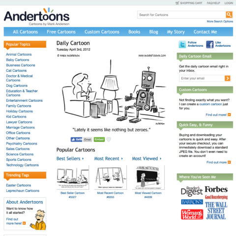
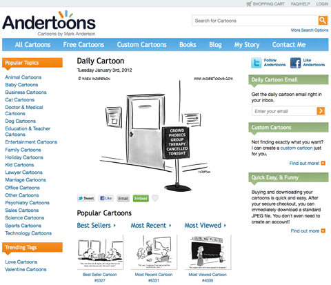
2012 – Larger, cleaner, and a little more white space.
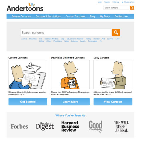
2015 – Larger and simpler still.

Well, that’s all of the old Andertoons.coms. Wanna see the new one?

Big Cartoons, Shiny New Website – Your New Andertoons

Andertoons.com is one of the best and most popular cartoon websites online.

There are thousands of great cartoons to choose from, and buying and downloading them is a breeze. Can’t find exactly what you’re looking for? I can create custom cartoons to meet your needs, quickly and at a fair price.

We also offer free daily cartoon widgets, a daily email cartoon, RSS feeds for over 20 different topics, books and minicomics, and over seven years of great blog content to peruse.

Andertoons also partners with outstanding sites like Small Business Trends and GoComics, shares thousands of cartoon related images on Flickr and Pinterest, and with over 13,000 followers and over 10,000 tweets to date, Andertoons is definitely on Twitter.

But…

We’re just getting started

After almost a year of planning, and more than 4 months of design and development, I’m very excited and proud to announce that we’ve just launched the best Andertoons.com yet.

Here’s just a few of the awesome new features:

It’s spectacular, so let me show you around. Let’s start with the…

New Design

Andertoons has always looked good and worked well:

old Andertoons.com

But we’ve taken that great design and tweaked it in all sorts of subtle but substantial new ways:

old Andertoons.com

Here are just a few changes:

  • Easier-to-read Helvetica navigation
  • Clear, prominent social media links
  • Plenty of white space (hooray!)
  • Better organization
  • And big, beautiful cartoons (which I’ll address in more depth later on).

But while we’ve made all sorts of improvements, the site feels and functions almost exactly like the Andertoons.com everyone is comfortable with. Pretty much everything is right where you left it, but it’s been cleaned up and polished a bit. Have a look around and you’ll see what I’m talking about.

I think it’s amazing, and I know you’re going to love it.

Improved Cartoon Search

old Andertoons.com

We were one of the first cartoon sites to really implement robust cartoon search. Users can quickly search captions, tags, and topics, making it quick and easy to find great cartoons. But sometimes the previous database’s brute force SQL approach gave you a quirky result. For example you might search for “cat” and get a business cartoon with “categorically” in the caption.

The new Andertoons search is really smart and lightning fast. It’s based upon the same open source full text search server that powers gigantic sites like Craigslist and DailyMotion. And not only are the search results better, but you can do all sorts of fun things like searching ‘”cat” and “office”‘ to find cartoons about cats in the workplace. You can even search for cartoons by their inventory number if you know them.

Our new search is really outstanding and it makes finding the perfect cartoon faster and easier than ever.

Speed

As I mentioned above, the new search function is unbelievably fast, but we’ve also employed some ingenious Ruby/Sinatra, CSS3, and image optimization to speed up page load times by as much as 600% in some cases.

Want to see just how fast Andertoons is? Check out the new “page generated in…” stat at the bottom of each and every page. I just loaded the home page in 0.282923666 seconds, and found a batch of cow cartoons in 0.029928941 seconds!

No more waiting for images or databases, just good old fashioned zoom.

Bigger, Better, Beautiful Cartoons

When I started Andertoons 10 years ago, the internet was a vastly different place. Sites still asked you to sign their guestbooks, no one knew what a blog was, and screen resolutions were 800 x 600.

It was sort of a wild west and anything went, which I think explains my decision to present my cartoons at 340 x 273 pixels. Here’s an example:

old Andertoons.com

We began with limited space and a goofy design and those dimensions worked for a long long time. But it was time for a big change (no pun intended):

old Andertoons.com

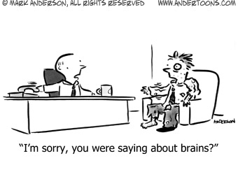
Each and every cartoon in the inventory has been recreated from the large original 300 DPI TIFs to a more usable 480 x 360, that’s around 40% larger than the previous images. And as long as I was doing that, I individually adjusted every cartoon for contrast and sharpness, and cleaned up scanning errors. I also replaced the variously sized captions with a uniform, legible font that’s really easy to read.

Basically, every cartoon is bigger and better.

Enjoy

So that’s the new Andertoons.com. Completely redesigned from the ground up, but comfortably familiar too. Have a look around, give everything a try, and I know you’re going to love it as much as I do!
New Anderithm

Some subtle changes to the Andertoons homepage recently.

The same cartoons were becoming cemented under Highest Rated and Most Viewed. And, subsequently, those were being rated and viewed more. It was an ugly circle.

So we made some changes to the algorithm so a greater number of cartoons could get their chance in the homepage sun. We also added a few more choices under most viewed.

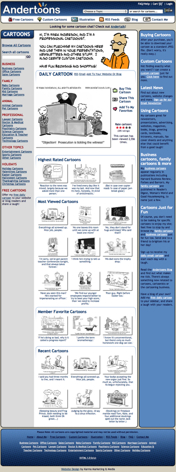
Here’s a look:

Anderythm2

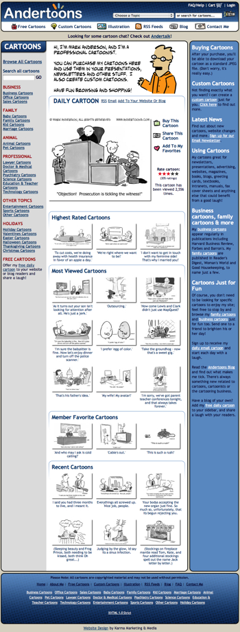
And then here’s another look after a refresh:

Anderythm

See the difference?

It was as much for me as anything. I just couldn’t take seeing that damn Frankenstein cartoon there every morning!

Hope ya like it!

Technorati Tags: , , , ,

Andertoons Redesign (I Just Can’t Leave Well Enough Alone)

It’s been a few weeks since I last looked at redesigning the site, and after looking at the last design with some fresher eyes, and spending WAY too much time drawing graphics for the left side buttons, I scrapped everything yet again and started fresh.

Drum roll please…

Andertoons2-1

(Click the image to enlarge to 1024 wide.)

OK, the buttons on the left are gone. I’m sorry, but there was just no way around it.

As the site expands and provides more and more features, screen real estate becomes harder to juggle. I’m also trying to leave some “white space” to avoid feeling too crowded. But, never fear, I didn’t get too Web 2.0/corporate; dig the little icons in the top horizontal menu bar.

I also did some new stuff for features underneath the cartoon.

Hopefully it stays playful while allowing me some more room to work.

Of course there’ll be more pages to change, but this is the final design and will define the rest of the site.

It’s still a few months away, but I was excited to show it off.

Hope you like it!

Technorati Tags: , , , ,

Another Andertoons Redesign (I know, I know…)

OK, I know I said I was done with this, but I still felt that some cleaning at everyone’s favorite cartoon site was necessary.

I really took to heart everyone’s comments, and I think you’ll like this.

Behold:

Newandertoonshomefinal

(Click the image to see it at 800 x 600)


I think it keeps the flavor and overall design of the original site…

Oldandertoons

(Again, click the image to see it at 800 x 600)

…while tightening things up and allowing for some small changes. (BTW, this will all go down sometime in mid January, so enjoy the current site while you can.)

I got rid of the waving/blinking guy (sorry), and the cartoon search triangle, which allowed me to fit a lot more in 800 x 600 before scrolling.

I kept the left navigation buttons, and actually enlarged them. No art for the left of the buttons yet, but that’s coming.

The big box o’ text is now a bright white to make things more readable, and recent cartoons got bumped up to a more prominent position.

Also, I tried to unify the design by utilizing a slightly rounded rectangular shape wherever possible, ass opposed to mixing odd shapes in the last design.

I also stuck to only web safe colors, so there’s some subtle changes in color overall.

One more thing – when you rollover the buttons, they’ll now appear to light up. (Check out the “Buy this cartoon” for an example.)

I’m really pleased with the end result. It’s still familiar, but freshened up, and it’ll allow me a lot more flexibility in content placement down the road.

Anyway, let me know what you think. Hope you like it!

Technorati Tags: , , , ,