Cartoons Make Your Content Powerful

Cartoon 1

We all like cartoons. But did you know they also provide a powerful punch to any social media or content strategy?  In fact, according to many expert social media blogs, they are an easy to use but  surprisingly powerful force in engaging audiences of all types across any industry.

Cartoons are one of our oldest forms of visual storytelling. The first comic book was introduced in the early 1800’s, and it didn’t take long for advertisers to begin using them in their marketing and learning how effective cartoons are in getting customers’ attention.

Cartoon 2

In fact, a University of California Santa Barbara study found that cartoons are 51% more effective than text in conveying a concept. By representing complex ideas in a fun, visual, and memorable way, cartoons are incredibly effective tools. (Fun fact – Did you know Dr. Seuss got his start in advertising?)

Ilya Spitalnik in a B2C blog, Why Cartoons Have Power in Businesssuggests one reason why cartoons work so well:

“Because our childhood conditioned us to accept cartoons as a non-threatening form of communication, we absorb their messages in adulthood in a very different way compared to the jaded “keep your guard up” attitude we typically adopt… By eliminating the critical thinking for even a split second, we are suddenly open to new messages.”

And before you insert that next unremarkable picture into your blog or on your Facebook page, consider this; research shows that 64% of people, when given the option, would rather share social media containing a cartoon than a standard stock photo.

Cartoon 3

At Andertoons, we offer cartoon subscriptions that provide ongoing access to both timeless and trending cartoons. You and your company will have access to a constantly growing library of thousands of cartoons to complement your content. And you can use them in all sorts of ways including social media, email, and more.

Have a cartoon success story? We’d love to hear it! Leave a comment and let us know.

Research Shows 64% Would Rather Share a Cartoon Instead of a Photo

After testing over 300 participants, I believe I’ve demonstrated that cartoons are more than simple entertainment, they are potentially powerful social media tools when used correctly.

Why Do We Use Images?

To begin with, images are aesthetically pleasing. Great masses of text are fine, but a reader’s eye needs a place to rest. Images also help introduce, reinforce and clarify ideas. And if you’re concerned with SEO, image tags offer additional clues about your content. So while you shouldn’t judge a book by its cover, you don’t often see an unattractive cover on a bestseller.

Good visuals are important, and there’s no shortage of graphs, stock photos, and infographics to use. But I’d like to suggest an often forgotten or ignored visual to add to your repertoire, cartoons.

Cartoons are written off, I believe, because they’re funny. You’re trying to make a point, add to a discussion, or sell a product, and you’d like to be taken seriously. But you also want your efforts to be seen and, more importantly, shared. And cartoons have an inherent shareability that should not be taken lightly.

But while there exists much research and advice on why and how to use all kinds of other images, most of what you read about using cartoons falls under “people just like cartoons.” That is why I’ve attempted to measure the effect of cartoons on the sharing of associated content.

Cartoon vs. Stock Photo

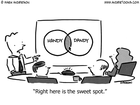
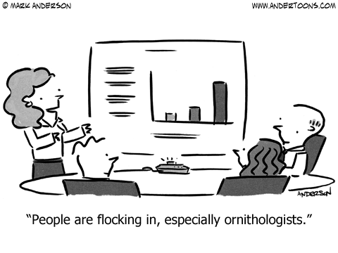
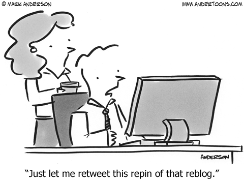
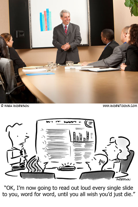
Three tests were conducted comparing this stock photo, and this cartoon:

Cartoon Study 1

The photo was purchased at iStockphoto.com. The color photo was resized and slightly cropped to 480 x 360 pixels. iStockphoto shows an initial upload of the photo on 6/17/11. It has sold more than 100 times.

The cartoon is from Andertoons.com. The grayscale image is 480 x 360 pixels. It was created on 6/22/10 and as of this writing has sold 51 times.

Each test showed participants the images and asked one question:

“Pretend you’re going to tweet one of these articles to a friend or co-worker. Which article would you be most inclined to share?”

I chose Verifyapp.com to administer the test, and Enrollapp.com to provide anonymous paid participants. There were no indications provided as to the identity or purpose of the tester. And while participants could be categorized as Internet savvy (being early adopters of Enroll), I believe they are also representative of the kind of person who would be an active and enthusiastic sharer of online content.

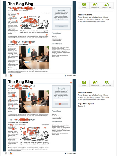
Test 1 – Photo & Cartoon Presented Together

The first test presented a generic blog page with dummy content. There were 110 total participants. 50 saw the cartoon image on top and the photo below, 60 saw the images’ placements reversed:

Cartoon Study 2

Tracking their clicks, those seeing the cartoon on top chose the content with cartoon an impressive 90% of the time. More interesting, however, is that when the images were reversed, those respondents still chose the content with cartoon over the photo 57% of the time, even though the cartoon was grayscale and further down the page:

Cartoon Study 3

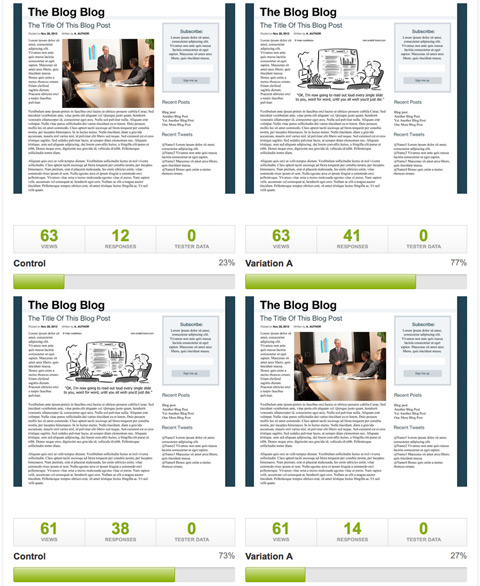
Test 2 – Photo & Cartoon Presented Individually

The second test presented two similarly generic blog pages with dummy headlines and text. Each page was identical except for the inclusion of the photo or cartoon. There were 105 total participants.

Two A/B tests were created, one with the cartoon as the control and the photo as the variation, and another test with these positions reversed. Because I later discovered that the positions of the control and variation are presented randomly by Verify, I think it’s reasonable to present the data from both A/B tests combined.

Combining the two tests, 75% indicated that they would prefer to share the content with cartoon vs. the content with photo:

Cartoon Study 4

This test also allowed participants to enter comments afterward:

“Somehow the cartoon (vs. the photo) makes it more informal, which I associate with Twitter.”

“The cartoon adds value to the text content, where as the stock photo is basically just decoration.”

“It has the cartoon and the caption underneath and it was funny. It made me more interested in reading the rest of it.”

“The humour (of the illustration) is something that reflects my personality so I’d be happy to share it. The stock photography version is trite.”

Some respondents did of course choose the photo, most often citing color as a key factor.

One participant did make an unexpected and excellent point:

“…I think this test is flawed, because the test is about visual content and not actual textual content, and I’d only really share a URL based on the substance of its message, not its accompanying imagery.”

Although my initial idea was to nullify surrounding content to more accurately gauge image effectiveness, I wanted also to be as accurate as possible. So I administered one additional test:

Test 3 – Photo & Cartoon Presented Individually (Actual Text)

This iteration repeated the conditions of Test 2 with one important exception: I replaced the dummy content with actual readable content about presenting effectively.

With 106 participants, readable text, and positions of the control and variation images again randomized, I was impressed that 64% again said they would prefer to share the article containing the cartoon:

Cartoon Study 5

Comments after the test included:

“I like the stock cartoon a lot more than the generic stock photo.”

“I think the cartoon graphic is interesting, it adds more value to the theme of the article. Which relays more information to the user.”

“I prefer the cartoon. It has a more personal relation with the article than an overused stock photo.”

“The image seems more engaging that a stock photo that we’ve probably seen many times already.”

Cartoons Are Underused And Undervalued

While I do not wish to present cartoons as a sort of social media panacea, after three quite different test iterations and over 300 participants, I believe the results speak for themselves. The cartoon competed extremely well for attention, and was seen as more interesting, engaging, and shareable than a traditional color photo. The demonstrated social benefit of complementing content with a relevant cartoon is clear and compelling, and savvy marketers can be advised to add cartoons to their marketing repertoire.
 

Visual Marketing & Cartoons

Visual marketing is big right now. Really big! But don’t take my word for it:

This year more than ever, visual content is going mainstream. – TechCrunch

No, really:

Visual marketing is Jedi-powerful. It can dramatically help you sell your products and ideas online. – grow

Seriously, it’s a really big deal:

Social media sites like Facebook, Instagram, and Pinterest have ushered in visual marketing as the breakout trend for 2012. When it comes to their products, businesses are learning to show, not tell, and visual content sites are fueling our desire for beautiful photography and sensational design. Two years ago, marketers were spreading the maxim that “content is king,” but now, it seems, “a picture really is worth a thousand words.” – Fast Company

And it’s no wonder:

Research at 3M Corporation concluded that we process visuals 60,000 times faster than text. – Billion Dollar Graphics

The numbers don’t lie:

Visual content drives engagement. In fact, just one month after the introduction of Facebook timeline for brands, visual content — photos and videos — saw a 65% increase in engagement. Simply Measured via Business to Community

And funny is better:

Finding something humorous is inherently joyful, so it makes sense that so many brands use humor in their marketing activities.Distilled

Funny is way better:

Funny images are easily the most popular images found on social media news sites and traditionally are the best topics for garnering votes. – Search Engine Land

That’s an awful lot of text to explain that if you’re looking to stand out online, tell your story visually. Or, put another way:

Visual Marketing & Cartoons

If you’re interested in really taking advantage of visual marketing, cartoons are a perfect fit. Check out one of my cartoon subscription plans, or try one of my custom cartoons.

Inking Cartoons – Video

Video Transcription –

Hello, this is Mark Anderson from Andertoons.com and I am going to show you how I ink my cartoons. We are going to do two different cartoons here in about eight minutes. I generally ink pretty quickly – oh there is my big giant hand – but I first, let me, my hand is really big and I work really small, so what I am going to do in this video is draw a little bit, pull my hand back so that you can see what I’ve done and as I move right and down it is going to be easier to actually see the inking as it goes, so just hang in there with me, it’s going to get better and you are going to be able to see more as I draw a little bit more, but I apologize for my big gigantic hand.

So we are doing two cartoons, we have a sales cartoon, you can see the sales graph there in the background and then about halfway through that then we are going to do another cartoon that is a lawyer cartoon with a dog, which is always fun, dog cartoons are fun.

So I start with a pencil sketch, you can – I am working on a light desk on my drafting table, I’ve got a really thin light desk that I like a lot and I am able to move it around fairly well. So what I do is I take the pencil sketch and I tape it to the back of the piece of paper that I am going to be using. I use Borden & Riley bleed-proof paper for pens and the pen I am using is a – in fact I have one right in front of me here – it is a Faber-Castell, Faber-Castell, something like that, Pitt artist brush pen; I really like these, I like the variances in line that I can get and I can work pretty fast – oh that guy is surprised, hello.

So that’s what I use and as I said I work pretty small, this cartoon is probably somewhere between 3 x 5 or 4 x 6. And there I am drawing the conference room table and I realized that I forgot to do the projector – something needs to be projecting that, I was getting – but I didn’t have it in my pencil sketch and rather than stop and go back and sketch it in, I just decided I’ve drawn a lot of these things so I just drew it in right there real quick, its not a big deal, its just a little box. I had toyed with the idea of saying, well it’s an overhead projector in the back that you can’t see, but I thought, no you really need to be able to see the projector putting that up on the screen, so just tossed it in there.

I move pretty fast when I ink, I know other cartoonists will pencil very carefully, I know other cartoonists who don’t pencil at all who just ink until they get it, which is really nice, I can’t do that that’s not how I work. I am using a pen to put in the sales text and that little point on the arrow there at the end, put a little thing. Few things here on the projector and I will use it to write in my signature and my caption. But yeah I really – I feel most comfortable using a sketch and inking off of that, I think the thing to be careful of when you do that is that you don’t worry too much about getting it to look exactly like the sketch, the sketch is an outline and when I am inking, and this is going to sound like an odd combination but it’s sort of a studied carelessness, you want that ink line to really look like you just dashed it off, you just threw it on the page and because – if you go really slow, oops the new cartoon, if you go really slow that line is just going to die right on the page – that’s an earlier ink that I had done that I got like two or three problems right away so I just started over.

So here I am starting on the dog lawyer cartoon. So yeah when I am inking I really try to make sure that it just looks dashed off, I am not really worried about getting all the lines exactly right, I am not – little mistakes, I will even put a little mark on the final art to fix it in Photoshop and I will make a little error and off course that will all get fixed, but even then I only use Photoshop for – if I really like 95% of the drawing and there is one glaring error that I need to fix I will do that, but even little errors I like, I like little things where the line goes too far or well that hand looks more like a squiggle than a hand, I am okay with that because I think that’s, it feels real and authentic and organic and I just like that feel.

So we are about five minutes into the video, we’ve got like two or three minutes left to go, but you can see I am already on the second cartoon, this is a dog at a lawyer and he is talking to the lawyer, the lawyer has his hands folded there. That was the part that sort of tripped me up on the first one, was those lawyer’s hands folded like that, I really wanted him to look like he was sitting back in the chair considering this carefully.

That first cartoon I was talking – the caption on it was – there is a sales graph and the sales graph goes up, down, up and then it goes way down, then you see like three bouncy lines and the caption is something like, ‘wow, I’ve never seen it bounce like that’, the idea that the line picked up so much momentum on the way down that when it hit the bottom of the sale graph that it actually bounced a little bit. This one the wording is trickier, and I don’t ever refer to me so I am trying to read it sideways now as I am watching this.

It is something about, ‘I will take your case, but I need to know everything. Mailman’ – oh what was it, mailman, boy I can’t read that, oh I am so sorry. Mailman, hydrants that’s the other thing and chew toys with a grudge, everything, the idea that if he is going to take this dog’s case that there can’t be any surprises. I thought of this while I was out walking one morning with my coffee and I was thinking about dogs and chew toys and I just really liked the idea that a chew toy would really hold a grudge and that phrase, those couple of words, ‘chew toy with a grudge’ made me, I actually laughed out loud on my walk, it’s like 6:30 in the morning and I walking down the sidewalk with my orange cup of coffee and I am laughing while I am listening to my iPod about this chew toy and I am sure, I guarantee there is someone on the other side of the street looking at me like I am a loon, ‘oh it’s one of those people’, no it is just your friendly neighborhood cartoonist, Mark Anderson, Andertoons.com.

So we are finishing up here, there are the books in the background to denote the lawyer’s office and that looks pretty good. If I were this lawyer I might take this dog’s case. You know what he looks like he got a bum rap there. That lawyer is missing an ear though, he has no ear and no hair, I think I put that back in. There I am writing in the caption so that I don’t forget it, so. And I don’t want to forget too, please visit Andertoons.com, there is thousands and thousands of cartoons on all kinds of topics, including dogs and lawyers and sales graphs and other things, so…

I hope you enjoyed watching me ink and I hope you have learnt something and enjoyed my ramblings. I am hoping you enjoyed them more than the person across the street from me when I was thinking of this. I probably sound more coherent coming from a video like this than across the street shambling along with my coffee. Hup, here comes the ear and the hair, hurray for me.

Alright, have a great day, thanks for watching. Visit Andertoons.com and have a good day.

Shading Cartoons With Markers – Video

A while back I did a video on shading cartoons in Photoshop, so I thought I’d also give you a look at shading my cartoons with markers as well.

Enjoy:

Video Transcription

Hi there, this is Mark Anderson from andertoons.com, and I’m going to show you how I shade my cartoons using markers. We’re going to jump right in here. I have got a batch of cartoons that I’ve already inked, they are all about school by the way. And I am using Prismacolor cool grey markers, I think this one it’s hard to tell but I think this is a 30%.

I usually let the ink dry for a little while, although if I am in a hurry, the markers or the brush pen that I use dries pretty quickly, so I can usually jump right in and shade right away. But if I have the time I like to give the ink just a little bit time to set, so I can make sure that it doesn’t smear. I’ve got four cartoons on a single page of, I don’t know, this is 8X10 or, oh it’s 9X12, I believe it’s 9X12 Borden & Riley Marker Bleed Proof Paper, and I tend to work really small and I try to be efficient. So I’ve got four cartoons on the one sheet of paper here that I am shading, and again about being efficient, I am using the same marker to do washers on all four cartoons at once.

So I’ll shade one cartoon with the 30%, and then I will flip the paper around like so and then I will continue shading with 30% until I figure out I’ve got over 30% is done, and then I will move onto 40, 50, 60, what have you. I don’t do well a lot of shading, you can see here like there is a desk that I am not shading, you couldn’t find, there we go. I’m not going to shade all of the grass behind this, I am not going to shade the sidewalk. I tend to stay pretty light, it’s just personal taste plus it’s a lot less shading and there is a lot less marker work to do.

It’s just one of those things that has evolved over the years, I used to shade a lot more and I used to shade a lot heavier and darker and as time is going on, I tend to almost never shade the background on my own cartoons. I also work pretty fast, as you can tell. I’m going to shade four cartoons here about 7 minutes from beginning to end. I know a lot of people shade all sorts of different ways, ink washers and of course, I also have a video where I’ve shade the cartoons on the computer using some custom patterns that I created in Photoshop, but even that takes longer than most because then I can undo, and oh I’m not sure if that’s quite right, there is a real organic, real feel to working like this that I really like. You are not getting the marker in all of the places and you get variance, and sometimes it’s darker and sometimes it’s lighter, and it’s just there is a real feeling to it that I can’t get any other way. So if I can shade this way, I prefer to.

I’m using my iPhone, I apologize for this sort of shakiness and sometimes if the light tends to change, I’ve got my iPhone, I’ve got a special clamp clipped to my lamp on my drafting table that’s taking this, which is pretty good video. Now that I’m looking at it, it takes a little bit to see the product that you are shading through the iPhone while you are shading it, so this isn’t like 100% natural, so I tend to get really close, I have bad eyes, I have terrible vision. So when I am shading I’m right on top of it, and maybe it’s because I work so small, I don’t know, but I tend to like get my nose, I’ve actually gotten like my nose print on art while shading that I have to write a little note, you know remove nose print in Photoshop.

But this, I’m actually back a little bit because I need to make room for the camera, so you are not going to see any nose prints today on the art. We’re finishing up a lot of these here, I am just doing some detail work, there is my giant hand, looks like I am doing some darker work. I tend to work with again Prismacolor cool grey markers, and 30% is about the lightest, I’ll go, I find that that scans pretty light. I used to go 20% and 10%, but then I’d do all of these different percents, and then I would scan them and pretend the 20 just wouldn’t show up.

So over the years, I’ve gotten it down to be between 30 and 60, if I need something really black, I’ll do 70 or 80 but that’s pretty rare. Now I’ve got my little fixed notes there, and I need to fix the A in that formula on the chart board via the back of the a little bit. I’ll write myself notes like that, I tend not to draw over, again I draw really fast too, so little mistakes, I’ll write myself a note and then I’ll Photoshop out any problems.

Doing just a little bit of shading back there on the periodic table, let’s now go and see, looking to see if I, doing the little 30% line work on that sidewalk to make that pop a little bit, oh hey we are shading the background, breaking my own, I didn’t expect that I would but then you have it. You can see I’ve got the caption written in pretty sloppily below, that’s just to remind myself the caption. There has been times I have done a cartoon and inked it and shade it and then I didn’t write the caption down on the final art, and I had thought, oh I will find this sketch out or I will remember it, and I never do, and then I have a cartoon where I am like, oh, oh what was that caption, it’s driving me crazy.

Well we are finishing up here, there is four cartoons, and we are coming up to the end of the video, hope you liked it, feel free to see all of my cartoons on andertoons.com, there is thousands and thousands there, and I hope you enjoyed this look at me shading my cartoons with markers. I hope you learned something, I had a lot of fun, and I’ll see you next time.