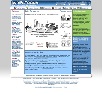
It’s been a few weeks since I last looked at redesigning the site, and after looking at the last design with some fresher eyes, and spending WAY too much time drawing graphics for the left side buttons, I scrapped everything yet again and started fresh.
Drum roll please…

(Click the image to enlarge to 1024 wide.)
OK, the buttons on the left are gone. I’m sorry, but there was just no way around it.
As the site expands and provides more and more features, screen real estate becomes harder to juggle. I’m also trying to leave some “white space” to avoid feeling too crowded. But, never fear, I didn’t get too Web 2.0/corporate; dig the little icons in the top horizontal menu bar.
I also did some new stuff for features underneath the cartoon.
Hopefully it stays playful while allowing me some more room to work.
Of course there’ll be more pages to change, but this is the final design and will define the rest of the site.
It’s still a few months away, but I was excited to show it off.
Hope you like it!
Technorati Tags: andertoons, cartooning, cartoonists, cartoons, websites

Hey, it looks pretty good to me. I like the one big cartoon in the center, and the navigation is all there for the clicking. The colors are good. It's arguable whether you want the blocks of text on the right. I mean, on the one hand, cutting the text would make for more open space and a cleaner look — but on the other hand, you've all ready got your pitch in those text blocks, right there on the home page, along with who you are and the ease of using the site to purchase cartoons. That's IMPORTANT info. for a new client to see.
Let the comments roll on ….
I like it. I think this design will give you a better search engine ranking too – text links seem to get you higher than image links.
I've experimenting a bit too. Thught wuite different, we've both come up with the same basic concept…strange but true!
Happy New Year Mr Anderson.
Hey Matt! Nice layout!
And happy new year back atcha!