Andertoons Redesign(!) – Part 3

200Px-Newcoke
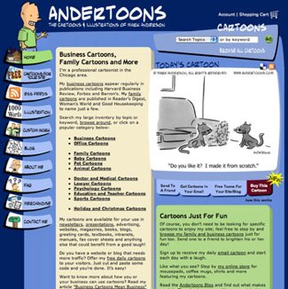
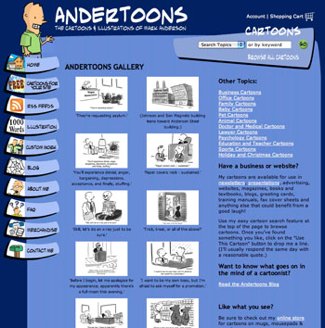
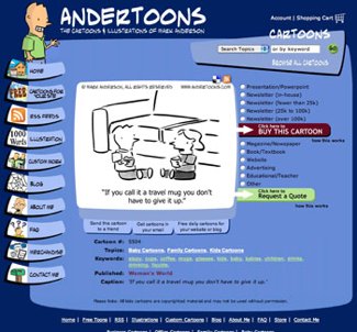
OK, after a good night of sleep, some coffee, and some fresh eyes (I hate using that phrase now, but it’s true), I still sorta like that last design. But only kinda.

After a good long conversation with my wife, I think I’m gonna leave the site just like it is.

I’ve gotten so many people writing to say how much they liked it, that it seems silly to make any sweeping changes just to satisfy my need to redecorate.

And that’s really what it was I think. I look at the site every day, and after a while I start to get bored with it.

Every six months or so I dig into Photoshop for a weekend and totally redesign the thing from scratch. The wrinkle this time is that I could actually do it within my plans without a lot of extra cost.

It’s kinda like a puzzle. My wife digs sudoku, and I like to make an 800 x 600 box that looks attractive, has everything I need, and functions well.

Anyway, the site works wonderfully as is, and everyone seems to like it (myself included), so let’s just call this whole redesign thing closed.

Technorati Tags: , , , ,

Andertoons Redesign(?) – Part 2

Wow. A lot of people didn’t like that last design at all.

Most people said they missed the rollover menu on the left, and that the site was, well, boring.

After sleeping on it for a night, I have to agree. (One point for the wisdom of crowds!)

So, after about 3 hours of fiddling, erasing, deleting, copying, fiddling, etc… I think I came up with a concept that you might like better:

Newandertoons2

(Again, click on the image to see it 800×600)

It continues down past the screen break, but I wanted to see what would show without scrolling.

After playing with some basic shapes and some layer effects, I ran across this sort of paper scrap concept.

I tried to make all the shapes a little abnormal so it looked more or less hand cut, and I arranged them not necessarily in line with each other.

I’ve also decided to keep the rollover buttons on the left, but I didn’t fill anything in pending a final design.

After so many hours looking at this it’s honestly a little hard to be objective. So, crowd wisdom here I come!

Whatcha think?

Technorati Tags: , , , ,

Andertoons Redesign(?) – Part 1

OK, so I’m considering changing the overall look and feel of the site.

I’ve already gotten some very nice and helpful comments on my previous post, so I thought I’d show you what I had in mind:

New Andertoons 1

(Click on it to see it at 800 x 600)

The reason it’s in grayscale is that I have no idea what I’m doing when it comes to color.

So rather than confuse the design right out of the gate with horrible color choices, I thought this would make seeing the layout easier.

I’m thinking of ditching the little animated tabs on the left for a cleaner top menu. I’m thinking the words would change color on rollover.

Other pages would follow in much the same vein.

So, whatcha think?

Technorati Tags: , , , ,

WWYD?

I’m doing some tinkering/cleaning under the ol’ Andertoons.com hood, and my programmer asked if I wanted to make any design changes while he was in there.

Apparently the changes are wide-ranging enough that redesigning the look of the site wouldn’t add to the cost. (Yippee!!!)

I’ve been dreaming about doing this for a good long while, and this is the perfect opportunity.

So, dear readers, what would YOU do?

What parts of everyone’s favorite cartoon website would you like to see changed?

Color scheme? Layout? Fonts? Lemme have it!

Lose the waving guy? Trash the animated menu? Get all Web 2.0 on it? I’m open to anything!

Here’s some current screen shots to get you thinking:

Andertoons


Andertoons2

Andertoons3


Please don’t make me design the new site on my own! HELP!

Technorati Tags: , , , ,

Andertoons Oatmeal

No, this entry isn’t about another Andertoons food product, it’s the first Andertoons greeting card for Oatmeal Studios:

Oat1

Oat2

Not bad huh?

The kinda weird part is that a lot of this card wasn’t done by me.

The color? Oatmeal. The inside cartoons? Oatmeal. The smudge under the word ‘but?’ Oh. I think that’s Andertoons chocolate. Ahem…

Just for reference, here’s the original:

3907

Notice any other changes? (Hint – check the patient’s gender…)

Don’t get me wrong, I’m not complaining, it’s just weird seeing my work redone by someone else.

Oatmeal is lovely to work with, the pay is fine, and they certainly saved me a ton of time and effort making changes. It’s just a weird feeling looking at stuff that’s mine, but that’s not really ‘mine.’

Here’s some close-ups of the card’s interior characters:

Oat3

Oat4

Oat5

Some obvious Photoshopping from the original, but they definitely had to invent some stuff on their own. The woman’s hair, for example, is probably more realistic than the women’s hair I normally do.

And I think the coloring is nicely done – subtler and more professional than my version for Good Housekeeping:

3907Gh-1

Like I said, it’s fine, just an odd feeling. I wonder if guys like Schulz felt/feel weird about this too.

I suppose after a certain point you’re fine with it, and anyone of that caliber certainly has other things to think about, but it’s a first for me.

Anyway, let me know if you run across this in the wild at Target or something!

Technorati Tags: ,