No, this entry isn’t about another Andertoons food product, it’s the first Andertoons greeting card for Oatmeal Studios:
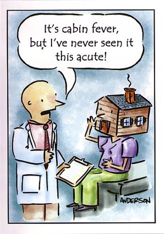
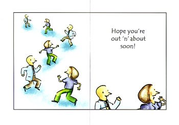
Not bad huh?
The kinda weird part is that a lot of this card wasn’t done by me.
The color? Oatmeal. The inside cartoons? Oatmeal. The smudge under the word ‘but?’ Oh. I think that’s Andertoons chocolate. Ahem…
Just for reference, here’s the original:
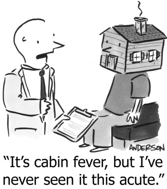
Notice any other changes? (Hint – check the patient’s gender…)
Don’t get me wrong, I’m not complaining, it’s just weird seeing my work redone by someone else.
Oatmeal is lovely to work with, the pay is fine, and they certainly saved me a ton of time and effort making changes. It’s just a weird feeling looking at stuff that’s mine, but that’s not really ‘mine.’
Here’s some close-ups of the card’s interior characters:
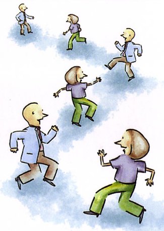
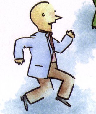

Some obvious Photoshopping from the original, but they definitely had to invent some stuff on their own. The woman’s hair, for example, is probably more realistic than the women’s hair I normally do.
And I think the coloring is nicely done – subtler and more professional than my version for Good Housekeeping:
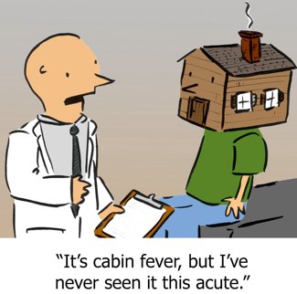
Like I said, it’s fine, just an odd feeling. I wonder if guys like Schulz felt/feel weird about this too.
I suppose after a certain point you’re fine with it, and anyone of that caliber certainly has other things to think about, but it’s a first for me.
Anyway, let me know if you run across this in the wild at Target or something!
Technorati Tags: andertoons, greeting cards
