
Wow. A lot of people didn’t like that last design at all.
Most people said they missed the rollover menu on the left, and that the site was, well, boring.
After sleeping on it for a night, I have to agree. (One point for the wisdom of crowds!)
So, after about 3 hours of fiddling, erasing, deleting, copying, fiddling, etc… I think I came up with a concept that you might like better:
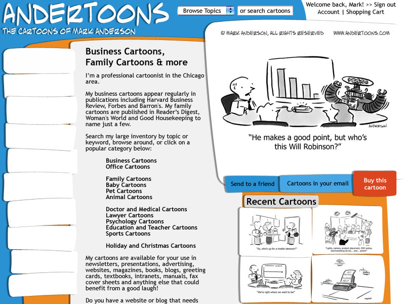
(Again, click on the image to see it 800×600)
It continues down past the screen break, but I wanted to see what would show without scrolling.
After playing with some basic shapes and some layer effects, I ran across this sort of paper scrap concept.
I tried to make all the shapes a little abnormal so it looked more or less hand cut, and I arranged them not necessarily in line with each other.
I’ve also decided to keep the rollover buttons on the left, but I didn’t fill anything in pending a final design.
After so many hours looking at this it’s honestly a little hard to be objective. So, crowd wisdom here I come!
Whatcha think?
Technorati Tags: andertoons, cartooning, cartoonists, cartoons, websites
