Sketching, Resketching & Inking Cartoons

Video transcript:

Hi there, this is Mark Anderson from Andertoons.com and today I am going to be showing you how I sketch and re-sketch and then ink a cartoon. What’s different this time, I have done a number of videos where I have drawn a business cartoon or a family scene, some sort of cartoon scene that I am used to drawing because of course I want to put my best foot forward there on the video and look like I know what I am doing, but I thought it would be interesting this time to draw a scene for you that I haven’t drawn before. It’s an idea that I got when I was at a bank recently and although it doesn’t look like that now, it’ll make more sense later and I’ll explain to you why I got the idea, but it’s a–I am going to be drawing a guy here in bed who has died and then a grim reaper and a ghost. But this isn’t a scene that I’ve necessarily done before so I am just sort of winging it here and doing a very rough sketch to lay things out.

So there is the guy and he is laying in bed now I’ve sort of got to the angle of the scene roughed in, there is the pillow and I am keeping this very, very rough and very loose and trying to go fast and you know keep it lively. So you are going to see lots of sketchy lines and things that aren’t going to make it into the final art of course. But it’s just the way–see there I drew it like a head where I wanted it and then I decided I didn’t want it there. Now it looks like I am changing something again I don’t quite know am I putting–I’ve recorded this voice over later so it’s been a couple of weeks since I drew this, so I am sort of watching along as you go here, sort of like a director’s cut of the cartoon.

Oh here is the ghost, here’s like the idea of the ghost coming out of the guy, I am sort of drawing it over there and there is his ghostly arms and there’s he is coming out of the chest of the old man laying in the bed. Yeah I’ve abandoned–I abandoned that head over to the upper right of him. Here comes the grim reaper, again I just started with real basic shapes, he’s you know the grim reaper sort of this hooded shrouded figure, so I start with this circle for the head and a triangle sort of over it and a wavy line to make the robe. So very, very basic kinds of shapes and lines and I am just moving fast and I am not worrying about making mistakes and as I go the things that I like I tend of reinforce or draw darker or yeah to go over the line again. Oh here I am sort of going back and this guy and adding a few hairs in and this mouth I sort of jump back and forth.

I am not sure if there is any rhyme or reason necessarily, it’s just sort of letting my self go. So there is the grim reaper, now I am drawing his, is that a sickle is it? No it’s a–oh I am never going to pronounce this right I got myself into recording. Is it a scythe? Is that how you say that? Is that the correct term for that? Wow you know what I should’ve looked at it out before recording this. Note to self – If there is an important part of the cartoon and you don’t know how to pronounce it, look it up before recording the voice over for the video.

So here is my the rough, rough sketch and what I am going to do now is take this and why am I signing my rough sketch? I am going take this and I am going to trace over using my light desk. Those are good transition, nice job iMovie. So there I’ve got the rough sketch under a clean sheet of paper and I am taking my pencil here and I am redoing, going over those lines and again I am trying to keep it fast and fluid but I am sort of giving myself a cleaned up sketch to do the ink off of.

So I’ve got the basic idea of the cartoon there and I am just going to clean it up so when that I ink it’s the best possible version of this cartoon. So there is a lot of–I do a lot of editing and a lot of redrawing cartoons, there is my first sketch and often times it takes more than one clean up sketch. Sometimes I do 2, 3, 4, if I started to get into like the 3rd or 4th sketch I know that something is wrong and I then need to start over or figure out how to draw what I need to draw and take another look at it, so generally its that first rough sketch and then the next sketch and then I move on to ink after that.

So here’s our grim reaper, he is looking pretty good. He is a–he is going to be talking to the ghost here you can see it, oh it looks nice. Then I’ll be drawing the ghost in here. When I do the ink for this what I will do is draw the ghost separately from the rest of the cartoon and then when I scan it in I’ll scan in the grim reaper at the bed with the dead man and then I’ll also scan in the ghost and I’ll put the ghost in on another layer in Photoshop because I want to change the opacity there and have him appear like he is–this transparent or you know translucent ghost over the scene and that was something that I sort of thought of when I did this and thought that it would be fun to do so, here is my clean up sketch, that’s looking pretty nice that’s all right. Okay nice job me.

Re-focusing the camera there it’s looking pretty good. I am not drawing a lot of background in here. Oh see now there I go, I am just I didn’t like the little wave on of his ghosty body so I am sort of going over and redoing the arms again giving his head a little bit more of a squiggle so that he appears more ghostly and I apparently did not like the shape of the hood on this grim reaper. But yeah that’s looking pretty good. Am I doing another sketch? Like I said it’s been a while so I am doing another sketch. Wow! Remember that thing I told you like if I get to go the 3rd or 4th sketch I really need to take it a–yep I am doing another one. Here I go, look at me go. I am redoing this one, I want to get this one right apparently.

I am recording this on September 12th but I actually did this cartoon – I drew this cartoon on August 1st, so it’s about a month and a half later so I apologize for my apparent confusion over what I am actually doing here but that’s why it’s much later after I drew it. So I am on the third sketch here drawing my ghost coming out of the dead guy and the grim reaper will be talking to him, so now I’m getting that and again I am doing little the other hand a little squiggle to make his legs and feet and things in the bed.

You know by the time we get to a third sketch like this you just really start to worry a bit like, oh boy, you know, how bad is this going to be, how dead is this going to be on the page, so I am a little worried now rewatching that this cartoon is just going to lie there but I seem to remember that it turned out pretty nicely. I looked at it real quick before I started putting this video together and it turned out all right.

So again the thing that I tried to keep in mind is just to move fast–wow! You can’t see anything there, look at that giant hand! I just try to keep moving fast and loose and not be too careful. There is nothing worse than a cartoon that just looks like it’s just going to lay there. You really want this to pop and so I am not worried about getting the exact squiggle on the hood right you know, oh it goes up here and down here its just a nice little squiggly line and there it is. All right so there is the third and boy I hope it’s a final, I didn’t watch this before I started recording, obviously now I am–am I going to sign it again? Looks like neat little pencil trick there. That actually looked impressive. I think I’ve–oh okay, I like to put a box around the sketch so that I can sort of see like where I need to stop and start and stop drawing for the ink so its sort of like putting a frame around it so that I know I don’t need to go below here and I am writing myself a little note, I do this all the time. Yep I there right there I was like hmm–I think I’ll do that separately and do that in Photoshop.

So here I am doing the ink, I am sorry for the length of this; it looks like we are going to clock in at just about 15 minutes which I thought was long. When I looked at it I was like wow, it never takes me that long to do it, it’s that there its got that’s the time burglar that third sketch, but it all turned out for the best and when you think about it 15 minutes versus 10 minutes in the grand scheme of things to get a cartoon right, I will make that time investment I will add another 5 minutes to my work day to get this dead guy cartoon right. So now I am inking and give you a little bit more of a closer appearance so you can see that. I love these brush pens boy they are just so nice; they move so nicely on a page I keep think one of these days I am going to move to that Wacom that Cintiq is that what it is? Is that how you pronounce that? Another word I don’t know how to pronounce but that one’s made up so it doesn’t count. I keep thinking one of these days I am going to move to going all digital but boy I just can’t, I am not there I love that feel of pen and that ink on paper and just the way that it sits, there is just a good feel, I don’t know that I could get that, I know a lot of people do it and are really happy with it and I moved all my shading to Photoshop but boy I don’t know that I could ever give up like the ink and paper aspect of it, I just wouldn’t feel good about it.

Change something with the lights, lights there may be I just changed the focus on the camera. I have got a–I am doing this on a light desk and then sometimes I’ll also turn on my desk lamp depending on like how much I want to see it. So sometimes I have got light coming up from underneath and on top, like I said depending on how much of what I want to see for tracing or inking or penciling. I am not ashamed to have a whole bunch of lights and I’ll put more lights on if I think I need it I would do that. Here is the sleeve, its looking pretty nice, I put an arrow there, what is that arrow for? I made some sort of mistake I don’t remember what now; oh I bet it’s for the little crinkle in his elbow I don’t think that turned out very well. I bet that’s what I put that there for. Take that out in Photoshop.

So now see here I am taking the pieces of paper apart and you get to see it, oh! Oh yeah you don’t miss a thing I don’t know, at this umm…hmm…no, no, you dear viewer get to see every little bit, me repositioning things, taping things. May be I’ll go get a soda you get–it’s unvarnished. I am doing the ghost just a little bit up above there and here comes the ink. I am trying to keep it nice and wavy and I am not worried about little gaps between lines, I am not going to worry about making sure that everything is tightly closed up I don’t–its just not my style, I don’t but there is so many artists that I was influenced by but the ones that I always like to have that really loose style and they didn’t connect all the lines and I just always love the way that looked.

So I am finishing up the ink on this, there is the ghost floating above and I am writing another little note there to put that down and skin those in separately and put that over that in Photoshop and looks like I am going to be up there. Here comes signature and this cartoon is up on my website now, I believe what is the number of this cartoon? I need to get organized before I recorded these things. Anyway here is the final version of the cartoon, “If you are as satisfied with my service please take a moment to fill out the survey.” Guy said this to me at the bank and I thought I know there is a cartoon there. So thanks for watching and be sure to visit Andertoons.com.
 

Add Images to Email Newsletters – Video Tutorial

One of the best uses of my new cartoon subscriptions is email newsletters.

Cartoons are perfect for email newsletters where increasing opens by tenths of a percent is a big deal. So enjoy this short video, and consider pepping up your content and keeping your readers engaged by adding relevant and entertaining cartoons.

Video transcript:

Hi there, this is Mark Anderson from andertoons.com. And I’m here to show you in this short video how to add cartoons or really any other kind of image to your email newsletter. It’s a great way to encourage readership and sharing and it’s really easy to do, so let’s get started.

We’re going to use three different email newsletter providers here, we’re going to use – I’m going to show you how to use Constant Contact, we’re also going to use AWeber, and then we’re going to do MailChimp. MailChimp is the one I’m most familiar with, so we’re going to end with that one and finish strong. These other two if I fumble just a little bit bear with me, I’m not as used to them, but they are all similar and it’s really easy to do.

So, here we are in Constant Contact and we are going to create an email. Let’s pick a nice template here. We’re going to pick business. And here comes our readymade business template with all sorts of nice stock photography and places to put our text.

So, we’re going to get a cartoon and put it into the first article, it’s this one right here under article headline, and we’re going to click into the article block and then you can see we can go in here and highlight text that’s where we would write our article but we are concerned with the image, so we’re going to go over here where they have a space already for us to insert our image and we’re going to double click. Now don’t worry, it’s telling us that there are no images found but that’s only because we don’t have any images uploaded yet. So, what we’re going to do is click the upload image button. And we’re going to click select files and here I have all kinds of cartoons, I’ve got one picked up that we’re going to use, I’ll show it to you here. “I’m working harder on working smarter so I don’t have to work so hard,” and that’s the cartoon we’re going to use during click open and that’s going to upload that cartoon and we can add a description here if we want I’m not going to do that and press done and there is our image.

We can add a caption below it, again image description, we can make it a clickable link if you had this image say on your blog or on your website, when people clicked out in their newsletter it would be a way to get them over to your website. So we can also increase the size here… The maximum dimension for this particular template is 400 wide but you can go all sorts of different dimensions and it keeps the block so it keeps the dimensions correct and you also align it left, right or center. So, we’re going to go, we’ll go 350-ish here and we’ll insert that image. You could also change the size right in here so there you could see like before there wasn’t a whole lot of text that we can put over on that left side but now we can resize it and that looks very nice indeed. If you wanted to take up the entire width you can go to fit to block and that will fill up the whole work there. Really easy to do, of course you do want to remember to click save, now we are going to click save and that block in our newsletter is done, we have a great cartoon there and I’m sure people would enjoy reading that and then the article immediately below it. So, real easy, that’s Constant Contact, that’s adding a cartoon to our newsletter there.

Alright. Let’s go to AWeber. We’re going to do a new HTML message here, wait for that to load, let’s see which one should we do, this Leaf Wiggle looks nice, we’ll do this one, okay. Here comes our preformatted newsletter oh that’s very nice and again similar to Constant Contact they have a place all ready for us to add our image. So, we are going to double click on that and then we don’t have images again here in our library so we are going to upload a file. We will get that same cartoon and we are uploading it and there it is. We will change the size, you can see it’s pixelated a little bit but that’s because we are using the thumbnail, if you click original that will get us to the original size and then we can resize that at a good quality there, so you can see that looks very nice and we could align it center or right or left again we can put it in the link there is alt text for SEO and we will just click out of there and that looks very nice in that article indeed I think people would enjoy seeing that there and that’s pretty easy. So, you can see it’s very similar between the programs in fact we will go over here to MailChimp now.

And again very similar. We’re going to click in this block of text here to our Generitech customers and click at it. And we’re going to put this in between these two paragraphs and then we’re going to go to file manager, I think I already have this image, yes I do, I already have this image because I use MailChimp, I already had this in my library and again we’re going to keep these proportions, we’ll keep it at the size that it is originally but you can change that. You can align it left or right or text URL these are all very standard things, I’d like clicking opening a new window if I’m going to have the URL because that keeps your other window open. So, we’re going to save and insert image and you can see it’s showing us that are put it right in there and we’re going to go up back up here and click save now and doesn’t that look nice, right to our Generitech customers. They will have a nice message from us and a funny cartoon to keep them entertained and informed and opening their email newsletters from us every month.

So there it is, it’s very simple to add a cartoon to your email newsletter, people love them, they are great for encouraging people to open and read them and keep coming back. If people know there is a cartoon in your newsletter there is a much better chance they are going to open that because they want to see the funny cartoon again this month. People love to share cartoons, people love to send them to their friends, isn’t this funny, it’s a great way to give your email newsletter and even greater reach than you expect it.

So, that’s it. I hope that you enjoyed it and please visit andertoons.com where you can purchase cartoons individually or you can subscribe to a monthly subscription of cartoons, there’s a couple of different plans there and you can use all of the cartoons you want for email newsletters, presentations and what have you. So thank you very much and I hope you enjoyed it.
 

The Freelance Cartoonist And Self-Promotion

The modern freelance cartoonist is also, de facto, a self-promoter. You want and need to tell people about your cartoons and comics. After all, people can’t buy your cartoons or hire you if they don’t know you exist. The question is how best to spend your time, effort, and money to get the word out?

I’ve dipped my toe in older, more traditional marketing waters (agencies, postcards, cold-calling…), but by far the most success I’ve experienced has been online. This can’t be surprising, but it warrants the occasional revisit, and I like to think I bring some real experience to the table. I’ve been blogging since before my developer had heard the word “blog,” and tweeting well before everyone knew the 140 character limit.

So here are some online options for the savvy freelance cartoonist and how I use or don’t use them (your results may vary):

Your Website

Freelance Cartoonist Website

Please tell me you have a website, or a blog, or something. If not, stop reading this article right now and go take care of that. It doesn’t need to be fancy, but it needs to look professional. You can’t promote yourself if you don’t have somewhere to send people.

Your Blog

Freelance Cartoonist Blog

Blogging has been around a while, and it’s probably out of fashion, but it’s also an easy and effective way to create, present and organize a lot of content. If you have a site, a blog is a great addition. If you need a site, a blog can be a great way to do that too. I like WordPress personally, but there’s always Blogger or Tumblr.

I used to try to put a little something out every day, but this year I’ve been trying one really good in-depth post per week and I’ve been happier with the results.

Embeds & RSS

Cartoon Embeds & RSS

One of the ways I promote my cartoons from my site is to allow various embedding options and RSS feeds. This is the sort of thing where you’ll probably need a good developer to make it work, but making it easy for people to share your cartoons helps a lot.

Here’s an example of a cartoon from my site that I embedded in this blog post:

Click on the cartoon and you go to the page where you can buy it. There’s also a text link to give the search engines something to chew on. I also have an option where people can embed a daily cartoon thumbnail in their website or blog’s sidebar. It’s fun content for them, and some attention and a link for me.

Add to that my twenty or so RSS feeds sorted by topic, and there’s plenty of ways for people to get their daily cartoon fix.

Again, these options are more along the hire-a-good-developer route, but if you can do any or all of them, I’d recommend it.

Email

Cartoon Emails

This is an area where I can dovetail some of my efforts. I take the daily cartoon RSS feed and route it through Feedburner to repackage it as a daily subscribable email. It requires almost no maintenance on my part and it’s a cinch to set up.

Email is one method you should not discount or take for granted. When I recently changed how my images were being hosted and it created a small glitch for my daily email cartoon subscribers, the deluge of emails asking when it would be fixed was staggering. The inbox is a place you want to be.

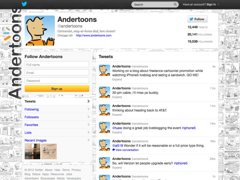
Twitter

Twitter

There’s all flavor of social media out there, but the one that fits my personal palate best is Twitter. It’s fun, quick, and easily sharable, just like a cartoon.

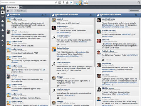
To organize people I’m following and to get tweets out quickly I use Hootsuite:

Hootsuite

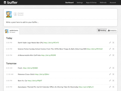
As far as tweeting goes, my general strategy with Twitter is 20% me, 80% other people. Using Buffer I schedule a daily cartoon tweet for mornings, and then 4 other retweets of stuff I like throughout the day. I again dovetail the process using IFTTT to push starred blog posts from Google Reader into my Buffer queue:

Buffer

I also tweet more depending on the day and my schedule. And Twitter’s integration into iOS makes things even easier now. I love me some Twitter.

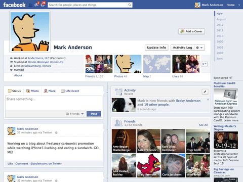
Facebook

Facebook

I should do more with Facebook, but to be perfectly honest, there’s something about it that just rubs me the wrong way.

There are people who are doing great things here, and you should probably figure out what they’re doing and how, but for the time being I’m just forwarding my tweets here.

Google+

Google+

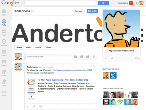
I was hot on Google+ for a while, and considering it’s almost certainly influencing Google’s search results in all sorts of ways I should be putting in more time here. But I haven’t seen a lot back for my efforts, and there’s only so much social media I can tackle in a day.

Pinterest

Pinterest 1

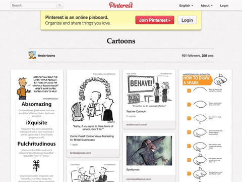
Pinterest was another thing I was really excited about. A few months before it really hit big I noticed it in my Google Analytics as a referrer and checked it out.

For a while I was seeing a lot of traffic from it, but as it grew and people began to figure out how to game it a little more, that’s dropped considerably.

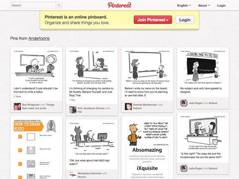
That being said I still like the occasional pinning binge, and I do see my cartoons appear on it regularly:

Pinterest 2

But as a place to put a lot of effort, I’m not convinced.

YouTube

YouTube

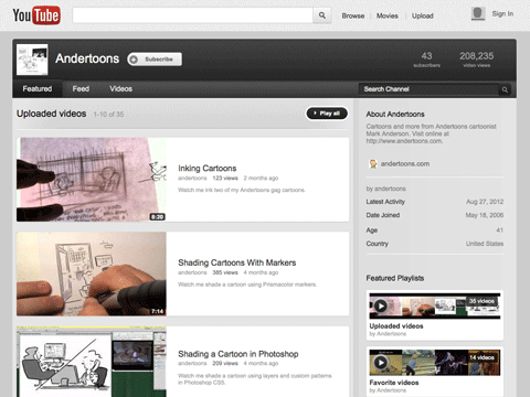
Video is a fantastic way to connect with people, and YouTube is obviously king in this arena. My strategy here is to create around one good size video per month while, more or less, doing what I normally do.

For example, with a camera mount clipped to my lamp, an iPhone, and a little time in iMovie, I made this short video of myself inking:

Not bad, not a lot more work, and, I think, very effective.

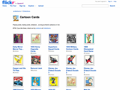
Flickr

Flickr

Although Flickr seems to have floundered in Instagram’s hipstery shadow, I still think it’s one of those important places you should have a presence.

I’ve used it mostly as a way to host pics of my large collection of cartoon themed trading cards. I’d blog about a set, show one pic, and then route people to Flickr to see the rest.

Do I see a lot of traffic from Flickr? Not really. Do I think it influences search results? Somewhat. Do I hope Marissa Mayer and company restore it to its former innovative glory? Definitely.

Other Sites

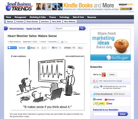
In addition the usual suspects above, a good freelance cartoonist should be looking for other more unique opportunities to partner with other sites. For example, every Friday for the past couple of years I’ve had a business-themed cartoon at Small Business Trends. They get relevant and entertaining content, I get some great links and access to a large readership. Everyone’s happy:

Small Business Trends

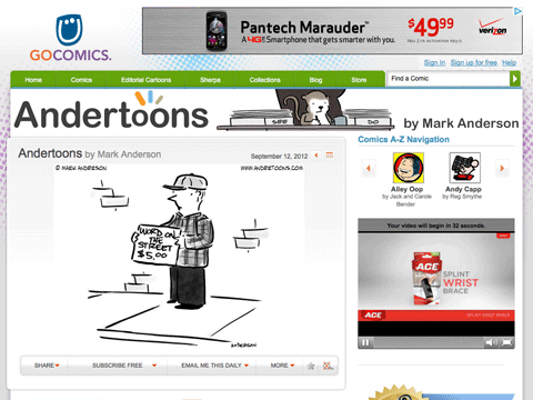
I also have a daily cartoon over at GoComics where I’m at just around 3000 subscribers as I write this:

GoComics

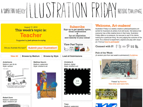
I also submit regularly to Illustration Friday:

Illustration Friday

I haven’t even mentioned Reddit, StumbleUpon, or Kickstarter, and as soon as I click Publish this list will most likely be obsolete, but it’s a good place for a freelance cartoonist to start.

Find what works for you, do it regularly, and get noticed.

Cartoon Shading in Photoshop – Cartooning Tutorial

Normally when I shade a cartoon I use my good old Prismacolor cool greys. But lately I’ve been doing a lot of custom cartoons where a client could ask for changes to the final art, so I shade in Photoshop using some custom patterns I made from those aforementioned Prismacolors.

It’s not glamorous, and there’s certainly more educational Photoshop tutorials available, but if you want to see a cartoonist laying down some shading while watching MST3K: The Movie, here you go:

Video Transription

Hi there, this is Mark Anderson from Andertoons.com and I am going to show you how I shade a cartoon in Photoshop. The first thing I do is I use an action that I had created to move all of my layers around, I will show you how to do that some other time, but what it does is it moves the ink to the top layer and then creates some layers underneath that makes the ink layer a multiply layer. I also created some patterns here for myself using my markers and the paper that I normally use and I scanned that in and created some patterns to emulate what I would normally do.

The reason I am not shading this using my regular marker and papers that I would use for my regular cartoons, is this is a custom cartoon that I am doing for a client, so I like to use my Photoshop markers so that I can create layer after layer after layer and then if the client requires something different or like a person’s hair color changed or we need to do this or that, I can go back and change it without having to redraw the original art, so that’s why I am doing this.

And of course I’ve got Mystery Science Theater 3000 The Movie playing over here on the right side. Shading isn’t my favorite thing to do, it’s sort of a necessary evil, so when I have a lot of shading to do – poor Dr. Forrester – I put a movie on sort of in a little window there to, that I can listen to or you know tune into here and there again.

So here I am shading, let me get back to the actual shading part; I use again my pattern brush and the eraser, those are the two tools that I really use when I create different layers. So this first layer here is sort of a light grey, I think it is a 30% grey, for her hair and for the computer here. Now I have created another layer and I am going to use a slightly darker pattern for the chair, so it is pretty simple, you just sort of lay the shading in as nicely as you can – now I see the, because I put that layer underneath the other layer when I color over by that computer that shading goes underneath that layer so that you can’t see it.

This is pretty standard Photoshop coloring shading sort of thing, but if you do not, you know if you do not know you know how…I am going to choose another slightly darker color for his chair to sort of make him pop a little bit. I’ve noticed sometimes I have problems, I use a Wacom tablet, and sometimes it seems like it has a problem, maybe it is Photoshop, maybe it’s the tablet recognizing like that I want a variable brush size and I have all the settings set up correctly I am pretty sure, and sometimes it just, it does not seem to recognize it, I don’t know what that is – if anybody knows, if there is something that I am missing here let me know, I would appreciate it.

So I am sort of erasing around his arm here and getting this shading more and more correct and this is going pretty well, there is actually not a whole lot to shade in this cartoon, which is why I chose it, sometimes especially with a crowd scene, or something like that there can be a lot a lot a lot of shading and I did not want to show you half an hour of ‘look, I am shading, now I am erasing, now I am shading, now I am erasing, now I am shading, now I am erasing’, this is already going to be tedious enough, but I will try to make it interesting for you.

So I think I am on my third layer now, and again I’ve taken that third layer and put it underneath the first two, the ink layer on top is set to multiply so that you can see things under the ink. And then I do my shading layers underneath that and they are all set to normal and then I have a background layer of just pure white. And then of course I have other layers for laying in the captions, and other things. There was another layer for that eBay logo but I had just merged that in there.

Okay, doing a little detail there on the desk making sure that that all makes sense. I left her shirt and her phone white because the desk and the chair have already been shaded. Okay I am just doing a little bit of detail work on the supposed eBay page. It doesn’t need to be detailed there, in fact it’s better if it is not because you don’t want people asking ‘oh what is she looking at, is she looking at a purse, is she looking at a toy, or is she looking at, what is she looking at’, it does not really matter you just need it to register as eBay, also that eBay logo is really big, I know, but you need it to register and read quickly, so you sort of fudge how big it actually is, so that the reader can actually read it and understand that she is on eBay, for the purpose of this cartoon.

Okay, now I am doing his tie, and I am sort of erasing his hand out of the tie – I try to be as detailed as I can when I lay in the shading because then it, it sort of, you can either be detailed when you put in the shading, or you can worry about the detail when you are erasing, and I sort of go in-between there. You try to stay in the lines as much as you can, that’s, that would be a nice feature on Photoshop is stay in the lines, although most of my lines don’t connect, so that’s not really going to work, but it would be nice if it could sort of intuit that.

So for the Adobe people get to work on that or if someone knows, again if you know how to do that and I am just missing it, let me know, drop me an email. Okay, doing the desk here, we are getting towards the end of this one; this is a pretty quick shade. Here I am sort of doing that, doing his desk here, I will go ahead and do some erasing, sort of get that edge there so that it does not look too jagged or you know. I am erasing here on the top of the desk, still watching Mystery Science Theater 3000 the movie. This is all the intro they haven’t started, the movie is really good if you have not, this Island Earth, this is a great, it’s not an episode of Mystery Science Theater 3000 but it is the movie that they made, really fun.

Alright back to, back on task here. I did some shading and some erasing that I didn’t like, so I you know controlled, I think it is Ctrl+Shift+Z to go back a couple of steps, so I am taking another shot at that. I would prefer to do all of the shading like right on the actual paper with the actual art, but like I said you never know, I have had enough times where a client has come back and wanted something changed that I’ve sort of learned my lesson, so it is not as organic a look as I would like, but what you make up for in being able to go back and fix things, totally-totally makes this worth it.

So looks like we are just about done, so this is the final version of this and I think it was only two, three, four layers of shading and I think that looks pretty good, so I will add the caption later, save this for the client and send – oh and look the movie is starting – so I think that is my cue to leave, thank you for watching, make sure you visit Andertoons.com for lots of great cartoons and other fun stuff. And have a great day.
 

How To Draw A Cartoon Leprechaun – Tutorial

St. Patrick’s Day is coming up fast, so I thought this week I’d show you how to draw a cartoon leprechaun in only twelve easy steps.

When you’re done, feel free to email, tweet, pin, share, or glarble (I made that one up) a pic of your cartoon leprechaun and I’ll post them here at the blog.

Good luck!

how to draw a cartoon leprechaun

Not bad, eh? Just 12 little steps and you’ve got yourself a really nice leprechaun cartoon!

More tutorials are coming soon, but if you’re still in the mood for drawing, feel free to check out my elephant tutorial here.