Shading Cartoons in Photoshop – Tutorial & Chat

Recently I’ve done some videos about sketching and inking my cartoons, and I got a request to show how I shade. So, here’s me shading a cartoon! Enjoy:

Video transcript:

Hi there, this is Mark Anderson from Andertoons.com. In this video, I am going to show you how I shade my cartoons in Photoshop. This is cartoon #6748, it’s about some bendy straws and one of those wacky curly straws, the teenage daughter has brought home the wacky curly straw, and there is no caption on here yet, I’ll fill in on the caption at the end but this is about shading, so let’s talk about that.

What I normally do is, I still do the ink on paper and then I scan it into Photoshop and create a layer, and the ink layer is a multiply one that’s on top, and then I shade underneath it. What I’m using is a pattern stamp tool, and the pattern that I’m using is actually one that I created from my old Prismacolor markers. I usually do all of the shading on the paper and then scan it all in and I miss being able to do there, but the older I get the larger I have to draw, because my eyes are – my vision is abandoning me as I get older.

So I have to draw bigger and that takes a lot of marker to shade, and it takes a lot of time, I was going through markers like crazy. So what I began doing a while ago is that, I still do the line art on paper but now I do the shading in Photoshop. So what the pattern I am using is I scanned in, I took my markers and did big, big swatch of shading on my paper and then I scanned it into Photoshop and created the sort of like never ending patterns from them. I tried to find, I usually have the bookmark of the tutorial that shows you how to do it, but man I cannot find that anymore.

So it’s a good thing I have those patterns, I backed them up so that I have them, but if you look online, I am sure there is no end of tutorials on how to create repeating patterns that don’t look terrible. Just Google that repeating patterns that don’t look terrible, I am so helpful. So what I am doing here is I am – what I tend to do is I shade big swatch of stuff, and then I go in and erase out the parts that I don’t like, you can see there is like some overhanging there on the couch that I am getting rid of now and I’ll sort of erase around the straws here so that they pop.

Normally, I wouldn’t shade this much on a cartoon, I don’t like to shade the furniture, I just normally shade what’s important and I will shade characters and their hair and their clothing and what have you. But for this one, the straw is needed to pop out, they need to be like those standard white bendy straw with a little stripe, so what I chose to do was shade the furniture and sort of cut them out of the, oh wrong layer, sort of I do that a lot. I’m not great at Photoshop, I’m okay at it, but I can get by – if nothing else by watching this video, maybe you will feel better about your own Photoshop skills because I am not great at it, but I am good enough and maybe if nothing else you feel better about your skills having watched me flounder around here for a little bit.

So yeah I cut out the stuff that I don’t want, so that’s what I chose to do on this, I am using like a 10%, what would be like a 10% marker, a real, real light, light shading so that they pop out a little bit, and I will probably shade the bendy straw so that he pops out a little bit as being different from the other straws, and those crazy whacky straws, I don’t know what the name for those are, but they are using like fluorescent, purple or green or something like that, so I am sure I will shade him a little bit later on here.

I’m not sure how these straws are seated – that was one of the problems of drawing this cartoon. My theory is this, is that there is shag carpeting and at the bottoms of the straws are stuck in this shag carpeting, and then they are really good at balancing up against the furniture so that they don’t fall over, that’s my theory, and you would think that I know being the creator but I don’t really and it’s one of those things like the more you think about it, the less you go like, the more you go like this doesn’t make any sense, I am shading the – some more furniture back there now and I’ll fiddle with the opacity, looks like I am fiddling with the opacity a little bit.

What I found recently is that, when I work in layers like this, opacity is not the greatest idea and I am sure everyone out there is like, well no because then everything becomes like see through and no, so what I have, hey look at that, I am adjusting the brightness, good job me, maybe this is the cartoon where I figured that out, and wrong layer, take two. What I do now is that I adjust the brightness or contrast, I forgot where that tool is in the menu, but adjust brightness I like using a lot, and then I can sort of fiddle with it, I like to fiddle, I like to shade things and then I’ll fiddle with them.

So here I am sort of cropping to the size I keep my full-size originals at, and then I should be putting the caption on here pretty soon, I got to get rid of that little scanning shadow out there, that’s a problem, yup, got rid of that, and here comes the caption, see — anybody want to take a guess there, before I fill it in. I will leave there little space, any caption ideas, alright here it comes. The caption is, I am creating my paragraph box, the suspense is killing you, isn’t it? Here it comes. Come on man, type it. “Philip is an artist!” That’s the idea behind this cartoon, so they are just regular straws but he is that curly straw and so he is not just any boyfriend, she is really pleased because he is an artist. And so that’s why he has got that curly top, so it looks like the mom is okay with Philip there, dad not quite sure, although I think the dad’s probably not quite sure of any straw that she brings home just because he is a dad, but I love the look of his face where he has got that raised eyebrow and that little line underneath where he is sort of squinting like, I don’t know what to make with this young man, I don’t like him, I don’t like him and I don’t approve.

So now I am going to do some more shading here, here it comes, so I am going to shade him and then we should be finishing up. I hope you have enjoyed this, I have a bunch of other videos on YouTube where I show you sketch and ink and do all sorts of other things, and of course please visit Andertoons.com where I have thousands of cartoons on all sorts of subjects including Bendy straws, thousands of cartoons on all kinds of stuff that you can use for presentations and newsletters and blogs and social media. I have the new cartoon subscriptions feature, which is really, really great if you need or want to use cartoons to complement your own content, so yeah come on over and check out andertoons.com, if you get a chance I’d appreciate it.

So just finishing up here, I am not exactly sure how much time I have left because they changed up iMovie on me, and it’s hard to tell, I know, wait, thanks to that little thing there, I am at 8:06 minutes and I think this is just about 9 minutes long so we are just about at the end. Usually the last thing I do is spellcheck before I save, because I am sort of paranoid about spelling, so when I see the spellcheck you will know that we should be just about done that’s sort of my ritual is, that’s the last thing I do. So I am not sure, hey look at that, spellcheck.

Alright everybody, thanks so much for watching, I hope you enjoyed it, have a great day. Good bye.



Cartoon Shading in Photoshop – Cartooning Tutorial

Normally when I shade a cartoon I use my good old Prismacolor cool greys. But lately I’ve been doing a lot of custom cartoons where a client could ask for changes to the final art, so I shade in Photoshop using some custom patterns I made from those aforementioned Prismacolors.

It’s not glamorous, and there’s certainly more educational Photoshop tutorials available, but if you want to see a cartoonist laying down some shading while watching MST3K: The Movie, here you go:

Video Transription

Hi there, this is Mark Anderson from Andertoons.com and I am going to show you how I shade a cartoon in Photoshop. The first thing I do is I use an action that I had created to move all of my layers around, I will show you how to do that some other time, but what it does is it moves the ink to the top layer and then creates some layers underneath that makes the ink layer a multiply layer. I also created some patterns here for myself using my markers and the paper that I normally use and I scanned that in and created some patterns to emulate what I would normally do.

The reason I am not shading this using my regular marker and papers that I would use for my regular cartoons, is this is a custom cartoon that I am doing for a client, so I like to use my Photoshop markers so that I can create layer after layer after layer and then if the client requires something different or like a person’s hair color changed or we need to do this or that, I can go back and change it without having to redraw the original art, so that’s why I am doing this.

And of course I’ve got Mystery Science Theater 3000 The Movie playing over here on the right side. Shading isn’t my favorite thing to do, it’s sort of a necessary evil, so when I have a lot of shading to do – poor Dr. Forrester – I put a movie on sort of in a little window there to, that I can listen to or you know tune into here and there again.

So here I am shading, let me get back to the actual shading part; I use again my pattern brush and the eraser, those are the two tools that I really use when I create different layers. So this first layer here is sort of a light grey, I think it is a 30% grey, for her hair and for the computer here. Now I have created another layer and I am going to use a slightly darker pattern for the chair, so it is pretty simple, you just sort of lay the shading in as nicely as you can – now I see the, because I put that layer underneath the other layer when I color over by that computer that shading goes underneath that layer so that you can’t see it.

This is pretty standard Photoshop coloring shading sort of thing, but if you do not, you know if you do not know you know how…I am going to choose another slightly darker color for his chair to sort of make him pop a little bit. I’ve noticed sometimes I have problems, I use a Wacom tablet, and sometimes it seems like it has a problem, maybe it is Photoshop, maybe it’s the tablet recognizing like that I want a variable brush size and I have all the settings set up correctly I am pretty sure, and sometimes it just, it does not seem to recognize it, I don’t know what that is – if anybody knows, if there is something that I am missing here let me know, I would appreciate it.

So I am sort of erasing around his arm here and getting this shading more and more correct and this is going pretty well, there is actually not a whole lot to shade in this cartoon, which is why I chose it, sometimes especially with a crowd scene, or something like that there can be a lot a lot a lot of shading and I did not want to show you half an hour of ‘look, I am shading, now I am erasing, now I am shading, now I am erasing, now I am shading, now I am erasing’, this is already going to be tedious enough, but I will try to make it interesting for you.

So I think I am on my third layer now, and again I’ve taken that third layer and put it underneath the first two, the ink layer on top is set to multiply so that you can see things under the ink. And then I do my shading layers underneath that and they are all set to normal and then I have a background layer of just pure white. And then of course I have other layers for laying in the captions, and other things. There was another layer for that eBay logo but I had just merged that in there.

Okay, doing a little detail there on the desk making sure that that all makes sense. I left her shirt and her phone white because the desk and the chair have already been shaded. Okay I am just doing a little bit of detail work on the supposed eBay page. It doesn’t need to be detailed there, in fact it’s better if it is not because you don’t want people asking ‘oh what is she looking at, is she looking at a purse, is she looking at a toy, or is she looking at, what is she looking at’, it does not really matter you just need it to register as eBay, also that eBay logo is really big, I know, but you need it to register and read quickly, so you sort of fudge how big it actually is, so that the reader can actually read it and understand that she is on eBay, for the purpose of this cartoon.

Okay, now I am doing his tie, and I am sort of erasing his hand out of the tie – I try to be as detailed as I can when I lay in the shading because then it, it sort of, you can either be detailed when you put in the shading, or you can worry about the detail when you are erasing, and I sort of go in-between there. You try to stay in the lines as much as you can, that’s, that would be a nice feature on Photoshop is stay in the lines, although most of my lines don’t connect, so that’s not really going to work, but it would be nice if it could sort of intuit that.

So for the Adobe people get to work on that or if someone knows, again if you know how to do that and I am just missing it, let me know, drop me an email. Okay, doing the desk here, we are getting towards the end of this one; this is a pretty quick shade. Here I am sort of doing that, doing his desk here, I will go ahead and do some erasing, sort of get that edge there so that it does not look too jagged or you know. I am erasing here on the top of the desk, still watching Mystery Science Theater 3000 the movie. This is all the intro they haven’t started, the movie is really good if you have not, this Island Earth, this is a great, it’s not an episode of Mystery Science Theater 3000 but it is the movie that they made, really fun.

Alright back to, back on task here. I did some shading and some erasing that I didn’t like, so I you know controlled, I think it is Ctrl+Shift+Z to go back a couple of steps, so I am taking another shot at that. I would prefer to do all of the shading like right on the actual paper with the actual art, but like I said you never know, I have had enough times where a client has come back and wanted something changed that I’ve sort of learned my lesson, so it is not as organic a look as I would like, but what you make up for in being able to go back and fix things, totally-totally makes this worth it.

So looks like we are just about done, so this is the final version of this and I think it was only two, three, four layers of shading and I think that looks pretty good, so I will add the caption later, save this for the client and send – oh and look the movie is starting – so I think that is my cue to leave, thank you for watching, make sure you visit Andertoons.com for lots of great cartoons and other fun stuff. And have a great day.
 

Another CS2 Easter Egg

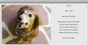
Francis

Another Photoshop CS2 easter egg that’s oddly sweet:

1. Select Photoshop’s Type tool.

2. Click the Toggle Palettes button to display the Character palette.

3. Select the Font Family field in the Character palette, and type the full name of a font that you have installed (e.g. "Verdana") followed immediately by typing one of the names francis, anthony, christopher, or mitzgy — you’ll get beeped at each letter entered beyond your font’s name, but just ignore it.

4. Now, click the Toggle Palettes button again, and you should see a hidden memorial for Francis 1991-2004.

Hat tip to CreativeTech Tips.

Technorati Tags: , , , , ,