Editing A Cartoon Caption – Writing Cartoons Tutorial

With only a very short time to engage a reader, getting a cartoon’s caption right is essential. So I made this short video on how I edit cartoon captions to get to the point. Enjoy:

If you’re interested in seeing more about how I write cartoons, check out these blogs:

Video Transcription

Mark Anderson: Hello, I’m Mark Anderson from andertoons.com, and this is a short video in which I’m going to show you how I edit my gag cartoon captions from their long, wordy original form, down to what I hope is a short, punchy, final funny caption, so let’s get started.

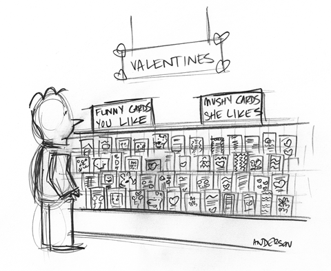
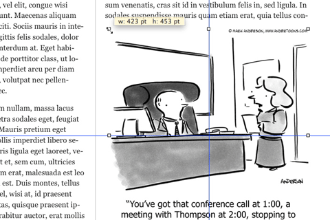
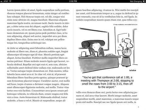
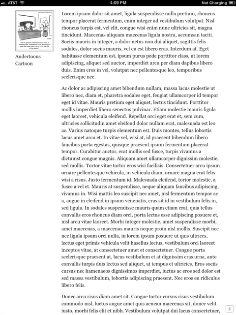
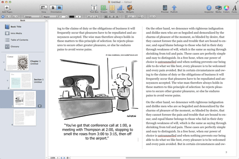
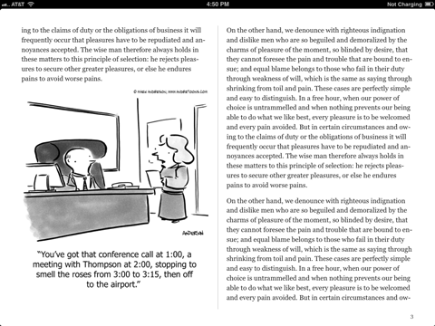
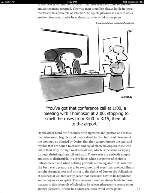
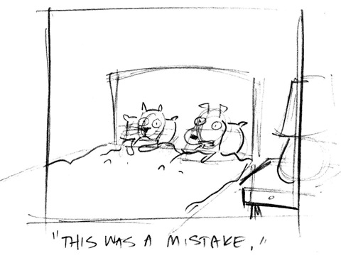
Here is the cartoon we are going to be demonstrating this with. The idea here is that this gentleman is giving a presentation with a Venn diagram that’s so complicated, that he had to use a Spirograph toy to do the diagram, and here is the original caption that I came up with:

“Okay, listen up everyone. I was up all night working on this, plus I’ve had to use a Spirograph…”

So all of the ideas are there, you have the Spirograph, I like that use up all night working on this, because it’s difficult, he wants everyone to pay attention, it’s all there, but it’s much too long, and it’s very varied, but this is just where we are going to start and we are going to begin pruning it back little by little, because usually brevity is wit.

While some very long captions are very funny, generally shorter is better, we only have a couple seconds to set the scene, introduce the characters; get the joke across, so a shorter caption in general is better, so let’s start editing.

Here is take two on this:

“Listen I worked all night on this, and I had to use a Spirograph to boot…”

This is still too long, and it sort of feels, it’s supposed to be unfinished, the sentence is unfinished, but this, it feels awkward at the end, and I think it’s to boot. That’s a phrase I use a lot, but I just don’t think it works here, so, and let’s take another shot at this:

“I was up all night with this and I had to use a Spirograph, so listen up people…”

Generally, I like to put the, like the joke part of the joke, for lack of a better way to put it, at the end of the caption, but I moved it to the middle here, and I really wish I could give you a good reason why, it just felt better to me. I like the idea that he’s up all night, and he had to use a Spirograph, and listen up people. So it just seemed to work better to me, but this is still too long a caption, so let’s take another shot:

“This took me all night, and I had to use a Spirograph, so everyone listen up…”

It’s getting better, we started with 20 words, and we are down to, I’m looking at this real quick here, 16? So we are getting better, we are getting shorter, it’s the, it’s getting punchier, but still we can, we can do better:

“This took me all night, and the use of a Spirograph, so everyone listen up…”

I like this better, but you try different words, you try different phrases, the use of is awkward, so it’s a good try, but we are going to take another shot:

“This took me all night, and a Spirograph, so everyone listen up…”

This is definitely better; this is pretty close to what the final caption ends up being, but we could still do better here, so let’s take another shot at this:

“This took me all night, and a Spirograph, so focus, people…”

I like “focus people,” “focus people” works better, me reading it out loud, than it actually does in print, I don’t know why that is, I think you bring something to it when you read it out loud, but it just doesn’t, if you take a second and read it, and feel free to pause as read, it doesn’t work as well in print as it does out loud, so let’s grab that:

“This took me all night, and a Spirograph, so everyone pay attention…”

It’s definitely getting better, we are really trimming this back, we are close, let’s take another shot:

“This took me all night, and a Spirograph, so pay attention…”

This is the final caption that I ended up with this on this cartoon, and I think it turned out pretty nice, you’ve got every thing you need in there, that he was up all night, that he had to use a Spirograph, because this was so complicated, that he wants people to pay attention to what he’s talking about, so I think we’ve trimmed it back as far as we’re, you know what actually when I was looking at this for this video, I could trim it back one more word, I’ll show you what that ended up being:

“This took all night, and a Spirograph, so pay attention…”

You know what, you lose the word “me” at the beginning of this, but what, this is really, this is really nerdy cartoonist. When you take out the word “me”, I get the idea that maybe he had somebody else working on it, and that he actually didn’t do, and that takes away from the humor, wow you can really over think this stuff, and I probably have, my goodness, but let’s put the word “me” back in, and it just works better:

“This took me all night, and a Spirograph, so pay attention…”

That’s the final caption, I think we got it, trimmed it down from 20 words at the outset, to 11 words now, it’s short, it’s punchy, it’s got every thing you need, and how much fun are Spirographs, come on.

So that’s it for, how I edit my gag cartoon captions, I hope you enjoyed it. Feel free to visit andertoons.com and check out all of the other cartoons I have there, so thanks for watching.

Valentine’s Day Cartoon – Sketch Video

I’m trying a whole new approach to blogging this year, and one aspect is going to be some video content.

And, since people seem to enjoy watching the drawing process, I’m beginning with a video of myself sketching an upcoming Valentine’s Day cartoon. It seemed a good place to start.

(Note – I don’t reveal the cartoon’s gag until the very end of the video, but if you’re one of those people who just can’t wait (like me!), I’ve posted an image of the final sketch below the video/transcript at the very end of this blog.)

Anyway, enjoy:

If you want to see the video bigger, you see it at YouTube here.

Hi there, this is Mark Anderson from Andertoons.com, and today I’m going to be sketching a Valentine’s Day cartoon. I’m only doing the sketch; I’ve done videos before where I’ve done a sketch and then the ink and then the Photoshop, but I thought this time I would just concentrate on the sketch portion.

So, here I am starting my guy… Here’s my big giant hand…

I tend to draw really small, as you can probably tell by the hand to drawing ratio. I draw relatively small. The final sketch will probably end up being like 5″ x 7″. I don’t actually have an oversized giganta-hand, but that’s why it looks so big.

This is an idea I came up with at about 4:30 in the morning yesterday. I was laying in bed, woke up and couldn’t get back to sleep, so sometimes what I do then is I sort of brainstorm ideas, and this one popped into my head.

(Sorry about the focus there. I’m using my iPhone on my lamp on my drafting table to record the video. So it’s a little shaky and sometimes the focus goes in and out. My apologies. This is the best system I could come up with other than hanging something over my head, and I’m not sure I want anything that permanent.)

The idea is a guy at a card store for Valentine’s Day. This will start looking better here in just a second. I think I’m writing “Valentines” on the sign above.

This is an idea I came up with the other day very very early in the morning. I have to make sure when I come up with an idea like that that I sort of repeat it to myself. I actually have to mouth it to myself, and I have to mouth it quietly because I don’t want to wake anybody up. I have to lay there in bed and say “Valentines. A guy shopping for cards…” I have to do it like two or three times, otherwise it won’t stick. Or I have to get up right away and go downstairs and write it down. In this case I got up, and went downstairs and wrote it down and now I’m sketching it here soon after.

I was trying to come up with something different than your standard Cupid cartoon, so I branched out into Valentines cards.

You can see I stay pretty loose with a sketch (the guy there is really sketchy). I start with basic shapes and do details from there. I would assume everybody sketches largely the same way. I don’t think I do anything special, but I thought it would be interesting to see how this works.

This ended up being a problem with all of the cards. I’ll tell you the idea at the end, I don’t want to jump to the joke. But part of the problem with this cartoon is having to draw all of these cards. There is a reason I have to draw somewhat specifically on each card to make the joke make sense. That will become evident at the end.

I’m using a ForestChoice pencil which I love! I adore these pencils. If you get a chance to get a box of those… I think you can just go to ForestChoice.com and buy them. I love ’em! They keep a nice point, it’s a good eraser, the pencil just feels good in my hand. I love these. I think the paper is just some standard laser printer paper.

So here I am drawing hearts and frilly lace stuff on the sides. The person there shopping for the cards is obviously a guy.

I tend to draw pretty heavy too. I normally, and you probably can’t see it in this video because I’m so tightly cropped on what I’m doing, I normally sharpen my pencils every 30 seconds. Even though the ForestChoice keeps a pretty decent point, I sharpen my pencils a lot. Because I just have a thing about sharp pencils.

Some more hearts and pretty Valentine’s Day cards… (Focusing iPhone.)

I apologize that you can’t see what I’m drawing there until my giganta-hand moves out of the way, but this is the best system I could come up with. I tried coming at it sideways, and this is the best system.

I actually tried drawing stuff on Photoshop. I got a nice pencil brush type thing on Photoshop and I tried it out because I thought it would be easier to record a screencast, but as much as I like coloring in Photoshop, I don’t like sketching and I don’t like inking in Photoshop. Maybe I just haven’t put in the time or gotten myself the correct tools, but sketching or inking I go really really fast, generally.

This one is slower, I think this whole video is about 10 minutes from beginning to end, and the reason this is… I can normally do a sketch in about half this time, but this is a scene I’m not familiar with. I don’t draw a lot of guys shopping for cards, so I haven’t learned the tricks yet of who goes where.

You know if this were a sales graph scene I could probably knock out a sketch for that in like two minutes because I know where everybody sits, I know where the table goes, I know how to set that scene. This is a different scene, and some of it is that there are a million cards to do stuff on.

So you can see on the left side I’m doing a happy bear, and there’s a cat, and a guy, and I tried to draw some cartoon panels and there’s a bunny, I think there’s a wolf… So I tried to draw funny cartoony stuff on the left series of cards, and on the right side I did romantic-y stuff.

Again, I won’t fill in the gag until the end, but see if you can figure it out.

The scene itself is pretty simple. You just have a guy, and then you have that sort of angled card display, and there isn’t need to do a whole lot more than that for this joke. I could draw another thing of cards in the background, and a woman shopping. Or I could draw a register in the background or a display or a sale thing. You could draw the whole card shop if you wanted to, but it doesn’t help the gag.

This gag has got to read quick. You’ve got like 3-5 seconds and so the card… It has to read that it’s a card store, it has to read that it’s a guy, and it has to read that they’re valentines. So you have to get all those things across, it needs to read left to right, and you need to do it all quickly.

You need to set the scene, set the characters, set all that stuff up quickly, so I tend toward as simple a scene as I can.Of course everybody likes to put in details now and again, of course that’s fun.

Here I’m sort of darkening this guy up so you can see him a little bit. Not that you can see him with my giganta-hand in the way, but I’m trying to darken him up a little bit. You get a little reflection off the graphite there. I apologize for that. Looks like I’m darkening up the signs that are up top.

There’s two sections of cards as I mentioned, so I’m starting to write what’s going to be the joke. There’s no caption, it’s a captionless cartoon, so there’s not a gag line underneath. It’s all dealing with the signs in the card store here.

I’ll end the transcript here and show you the finished sketch below:

valentine cartoon sketch

Thanks so much for watching, I hope you enjoyed it! And let me know if there are any other videos you’d like to see!

And feel free to check out some finished Valentines Day cartoons!

Adding a Cartoon (Or Any Other Image) To Your iBook in iBooks Author – Tutorial

As I’m sure you’ve heard, Apple recently entered the textbook market in a big way. They’ve partnered with Pearson, McGraw Hill, and Houghton Mifflin Harcourt, revamped the iBooks app/store, and created the iBooks Author application to make publishing and selling books quick and easy. This is a big deal, and I’ve got a front row seat being married to an educator and having two children in school.

But as exciting as it is educationally, as a cartoonist I’m thrilled not only by the self-publishing opportunities for myself and other artists, but by what could conceivably be a whole new market for cartoons.

I can imagine all kinds of people writing and selling all kinds of books via iBooks Author, so I thought I’d explain the process of inserting a cartoon (or any other graphic) to help liven up all of that text.

Starting Your iBook

The first thing you’ll need to do is download the free iBooks Author app from the App Store and wait for it to install. Open iBooks Author and you’ll be greeted with the Template Chooser:

ibook cartoon templates

For the purpose of this tutorial we’re going to choose the generic Botany textbook. Click on it and you’ll be greeted with the book’s first chapter in landscape orientation:

ibook cartoon template

Apple has already included a stock image to show you how much an image can improve your book, but we’re going to navigate to page three where there’s a huge swath of text just waiting for a funny cartoon to liven things up:

ibook cartoon text

Because this is a botany iBook, I’ve chosen this one about roses:

Now let’s get started!

Inserting Your Cartoon

There’s a number of ways to import your image, but I’m just going to grab the JPEG off of my desktop and drag it over the text:

ibook cartoon drag jpeg

Here’s how the image looks inserted into the text:

ibook cartoon placement

Nice, huh? Just what all those words needed.

The cartoon is placed on the page by default as either an anchored or floating object (that will be important later) which can be moved, resized, and aligned with some intuitive clicking and dragging:ibook cartoon center resize

Now our iBook page is looking just like we’d like it to. Let’s preview it on our iPad to see how it will look to our soon-to-be readers.

Connect the iPad to your computer, open iBooks, and, if you’re like me, you’re going to preview it in portrait orientation first:

ibook cartoon ipad portrait 1

Here’s a screen shot of page 3 from my iPad, but where’s the cartoon!? And what’s with all that white space on the left? Flip the iPad 90 degrees and you’ll see it appear in landscape orientation exactly as you inserted it:

ibook cartoon ipad landscape 1

So what’s going on? Where’s the cartoon in portrait?!

There are two ways to deal with this. The first changes some elements of the existing image, the second is a different way of bringing images into your iBook. Let’s start with what I think is the simpler of the two:

Adding a Title or Caption

Images imported into iBooks Author are referred to as objects, and there are three different kinds of objects. You might remember earlier I said that images are inserted by default as either anchored or floating objects. Those two types of objects don’t appear in portrait orientation unless you give them either a title or a caption. Thankfully, that’s pretty easy to do.

Click on your image, then click Inspector in the upper right menu bar. Next click the rightmost icon in the Inspector menu; it looks like a folder with a gear on it. (If you leave your mouse on it you’ll see “Widget Inspector.”)

ibook cartoon title caption

Click the Title check box underneath Layout and your cartoon now has a dummy text title as well as a light gray border around it:

ibook cartoon title changes

You can also opt to add a caption below the image instead, but since the image we’re using is a cartoon, I chose a title. I also played with the background and margin settings. Now let’s look at it in portrait orientation again on the iPad:

ibook cartoon portrait title 1

There it is in the upper left, and when you click on it:

ibook cartoon portrait title 2

Pretty nice. Here it is in landscape again with the title over the cartoon:

ibook cartoon landscape title

Now, you might not want that extra text above or below your image. In that case, still click Title or Caption, but just delete the dummy text and don’t replace it with anything. You get a little extra padding on the top and/or bottom, but it’s not obvious.

Adding A Cartoon Inline

I said earlier that there was another way to insert your cartoon into the text to make sure it appears in portrait mode, and that is to change the image to an inline object. This is best done when you’re first inserting the cartoon into the text, but it’s still fairly simple.

Let’s begin again with a page 3 full of text:

ibook cartoon inline prep

You could drag in your image and then change the object type to inline, but I’ve gotten some wonky results that way. Here is what I think is a better way to add images inline.

First, choose roughly where you’d like to add the cartoon and insert a blank line there. For this example I’m going to add it before the second paragraph on the left half of this page:

ibook cartoon inline blank line

Now this is where it gets tricky. Press and hold the Command key, then drag the image off of your desktop and into the document where you left your blank line:

ibook cartoon inline insereted

It might take a little trial and error, but you’ll soon get the hang of it.

And now when we preview on the iPad we see the cartoon inline in both landscape and portrait orientations:

ibook cartoon ipad inline landscape

ibook cartoon ipad inline portrait

With the inline method of inserting your cartoon there’s also no need for title or captions. In fact those are not available to an object designated as inline.

You might be asking yourself why you’d want to present your images inline, but if you’re considering publishing an iBook collection of cartoons where there’s very little text, inline begins to make a whole lot of sense.

As exciting as this new opportunity is, both as a potential publisher and content provider, there’s bound to be some glitches in this first iteration of iBooks Author, but I’m finding it hard not to daydream about the possibilities. And I can’t wait to see how other people use this new tool!

So now that you understand how to insert a cartoon or other image into your new iBook, there’s the small matter of…

Buying Your Cartoon

Of course the first step to adding a cartoon is to find a relevant cartoon you’d like to include in your iBook. Andertoons has thousands of cartoons on thousands of topics that are super easy to browse, buy, and download. That being said, this is a brand new market and I’m a bit unsure as how to proceed as far as price.

Normally I charge hundreds of dollars per cartoon for textbook usage, but I’m envisioning a lot of independent authors self-publishing via iBooks Author, so I’m going to begin selling iBook cartoon usage at the $30 per I currently charge for presentations.

If you’re interested in buying a cartoon for your iBook, just click the $30 presentation button and follow the checkout – no need to email me for permission. If you’re a big name publisher, drop me a line and we’ll work out something fair.

I hope this helped explain how to add a cartoon or other image to your new iBook via iBooks Author. Anyone have have any big plans for an iBook?

A Cartoonist’s Tools

I think every cartoonist is sooner or later asked “what kind of pen do you use?”

My normal response is usually that there is no “right” or “best” pen. Each cartoonist finds, usually through years of trial and error, the correct tools for themselves. Some prefer pen and ink, some like the cheapest ballpoints. (And remember, even the best art needs good writing first.)

But I also remember starting out, getting answers like that, and wishing I’d gotten a different answer; or at least a place to start. And it’s in that spirit that I’m going to go through pretty much everything in my office and explain how and why I use it.

Just remember, your results may vary.

Paper

paper sketches

For sketching I use a 24 pound bright laser paper. Pretty much whatever is on sale. I could certainly go cheaper, but I like the way that combination feels to me.

For final art I use Borden & Riley bleedproof paper for pens. It’s economical, and it stands up well to marker saturation.

paper art

I try to fit as many cartoons on a single piece as I can and then cut them out for scanning. You end up with all sorts of oddball shapes, but since I’m creating for reproduction, I don’t much care.

Pencils

I’m really picky about my pencils, and ForestChoice #2‘s are my hands down favorites. They work great, feel great, sharpen great, they’re just perfect! I buy the 144-count box.

pencils

If you like pencils like I like pencils, do yourself a favor and try these. They’re so good!!

Pens

pens

I use a few different pens for the final art: a Faber-Castell Pitt Artist brush pen, and varying thicknesses of Pigma Micron pens. Both stand up well to my punishingly heavy hand, stay black, and dry quickly, which I have to have because I work really fast.

Markers

markers

I’ve used Prismacolor cool greys for years and years, but lately I’ve been opting to use some virtual markers I created in Photoshop from scans of my Prismacolors on the Border & Riley paper. They’re not quite the organic feel of the real thing though, so I’m kind of on the fence here.

Desk

desk

I preface this with the reminder that for probably half of my career I worked hunched over a coffee table in our living room. But when we moved to a larger house and I got an office I splurged on this Alvin drafting table. It’s nice to be able to work without sitting on the floor.

Stool

swooper

And while we’re talking about sitting, my Swopper stool was another I’ve-got-my-own-office  splurge. It takes a little getting used to, but my back continues to thank me.

Taboret

desk

I built my own taboret (I had to look up the word “taboret.” I was going to call it my drawer thingy) out of various Elfa pieces at the Container Store. Easy, sturdy, and cost effective.

Light Desk

lightdesk

The way I work is to do a messy sketch, and then ink over it on my light desk. For years I used a much bulkier one, which was sort of hard to work on with my table, so this newer thinner LightPad is a Godsend. I still have trouble making the back “sticky” enough to store it on my desk though.

Lamp

luxo

Your standard sturdy Luxo combo. This thing is awesome and I adore it.

iMac

mac

I’ve waxed poetic about my Mac before, and usually someone chimes in and tells me I’m paying for the name and I’m a jerk and all that. But when my last iMac had 2 weeks left in AppleCare, and the Genius Bar couldn’t figure out my problem, they gave me a brand new iMac and a new AppleCare to go with it. No questions asked.

Apple, you had me at hello.

BTW, I also run a MacBook, 2 iPads and an iPhone. Call me a fanboy, it all works.

Scanners

I had my last Canon scanner for more than 10 years, and I loved it dearly, but this fall it finally scanned it’s last Andertoon. I replaced it with another CanoScan and the results are just as good in like 1 third of the time:

scanner1

I also run this Fujitsu ScanSnap for auto scanning reams of paperwork, receipts, and cartoon cards. Love it!

scanner2

Wacom Intuos 3

wacom

I still do so much work with actual ink on paper that I have yet to pony up for a Cintiq a new Intuos, or that Inkling thing. But when I need it, it’s a reliable workhorse. I couldn’t get along without it.

Photoshop CS5

cs5

I have some sort of bundle of CS5 stuff, most of which I rarely use. I’m also betting that I use only about 5% of what Photoshop is capable of, but there you go. I did do some playing around in Flash a while back, and occasionally I poke my head into Illustrator to change some line art into vector, but mostly it’s a lot of Photoshop layer coloring, resizing, etc…

So that’s it. That’s what I use to create my cartoons. Someone just starting out certainly doesn’t need all of this. Pen, paper, and a computer with a scanner is pretty much the minimum though.

There’s a whole separate set of tools for running the business, and probably another for running the site, but those are posts for another time.

(Just in case you’re curious, here’s a video showing how I draw my cartoons, and here’s a more in-depth look at my cartooning process.)

So, what tools do you use?

My Cartoon Process

Today I’m finishing up my new batch of cartoons for July. And this morning while scanning I discovered that for one cartoon I had a very clear visual progression of my process from beginning to end, so I thought I’d share.

Here’s the sheet where the idea is. It’s kind of hiding in amongst the doodles:

cartoon process 1

Here it is:

cartoon process 2

To be honest I wasn’t sure if it was even funny, so I ran it past my wife who chuckled (although, like me, she couldn’t quite figure out why) and then I sketched it up:

cartoon process 3

The thing about a sketch is you never really capture that initial vibe again. For me this is the best this cartoon will ever communicate visually, but unfortunately it’s not something anyone would publish.

I draw that box there to frame the image and let me know what I need to include, and what I can leave out.

Now on to ink:

cartoon process 4

This is a rejected ink. The look on their faces is off and that lamp on the side is waaaay too big.

Normally I’d fix it in Photoshop, but there’s enough here that I don’t like that I decide it would be more efficient to just start over.

Here’s the final ink for the cartoon:

cartoon process 5

I feel like I got the vibe as close to the sketch as I could. Also at this point I’m considering putting “this” in italics in the final. You’d be surprised how little tiny writing changes like that can make a difference.

cartoon process 6

Here’s the final version of the cartoon with the caption typeset (no italics BTW) and the shading.

I chose not to shade anything else in the room to keep the focus on the dog and cat. (Also, I don’t like shading large areas because there’s so many opportunities for problems to creep in.)

So that’s it! Hope you enjoyed this little glance at how I write and draw cartoons.