When I caption my cartoons in Photoshop, one of the things I tend to obsess on is how the words work underneath the graphic.
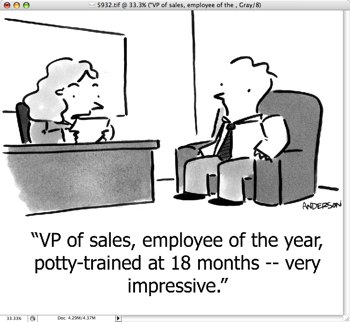
Here’s a recent cartoon, and you can see initially I had the word “very” on a different line than the word “impressive.”

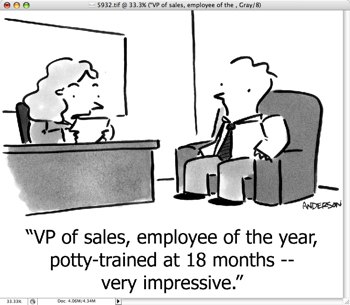
I didn’t like the way that flowed, so I changed the caption so the two were on the same line.

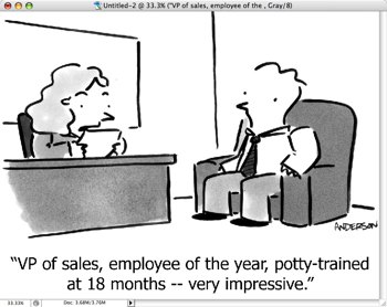
But then the caption looked too large, and I didn’t like the shape of the caption, so I changed it to this:

It might be better with “potty-trained” on the second line, but I always like the topmost line to be the largest, so I left it like this.
To be honest, I have no idea if any of this makes any difference whatsoever in the reading of the cartoon, but I tend to sweat the small stuff, and I’m fine with that.
Technorati Tags: andertoons, cartooning, cartoonists, cartoons

Most newspaper editors (if this were a headline) would encourage you to make your top line longer than subsequent lines, and dropping to a smaller point size to make two lines instead of three is better too. BUT, for a cartoon cut line, cadence is everything, and part of that cadence relies on the visual layout. By satisfying yourself, you chose the best one. The small stuff IS important!
Thanks for the great comment! I think I'd still like "potty-trained at 18 month — very impressive" on the second line by itself, but there's only so much even I can obsess on this stuff… Thanks again, Fontessa!
I agree with Fontessa–the details make the difference. Still, if the material is strong, as it is with your caption, I think you can get away with an awkward layout.
Awww… Thanks, Brad.
Pretty much good writing can carry almost anything, but its funny what you end up worrying about…
Hmm… my vote would be the second version, honestly. It kept the phrase "potty trained at 18 months" together. As that is the crux of the joke, and I think it would be important to leave it intact. You could make the whole thing a bit smaller in size, too. The type size you have in the third version is nice.
As a graphic designer (who cartoons on the side), one thing that I did notice was the use of the double hyphen " — ". Typographically, that isn't quite correct. There are three levels of dashes- the hyphen, the en dash, and the em dash. They look like this: – – — . A hyphen is used to join words, like "potty-mouthed". An en dash is used as a pause, like "wait up – thanks!". And an em dash is used to separate completely different phrases, like the one you have at the end of your joke, "…at 18 months — very impressive."
It's small thing, but it drives us graphic designers nuts. If you're on a mac (and I think you are), an en dash is Opt -, while an em dash is Shift Opt -.
You've got the real quote marks, though, so I applaud you!
Hey Chip! Good to see you again!
Yeah, honestly I'm always a little scared to use hyphens, knowing that I'm probably doing it wrong. (I'm only a little more brave with semicolons.)
So I gotta ask, is there such a thing as a double hyphen?
BTW, you'll be glad to know I've bookmarked this series of comments so I can refer back to your help. Thanks!
As far as I know, the double hyphen is not a "real" typographic mark. If you want to really be correct, you sould use either the en dash or the em dash.
Does that mean you can't use a double hyphen? Of course not. They're your cartoons, after all.
Since the post and the ensuing discussion was about sweating the small stuff, I thought I'd bring it up. If you haven't already read it, I would pick up "Eats, Shoots & Leaves" by Lynn Truss. It will explain the hyphen thing much more effectively than I am, as well as other punctuation subjects. It's a quick read, so I would suggest getting it out of your library.
That's one I've been meaning to get around to for a while. Thanks!
(I gotta tell you too, I've even been looking at my comments more carefully now. Look what you've done to me! 🙂 )