OK, so I’ve had these two cartoons sitting on my desk for about three months now. They’re bad cartoons.
They’re cartoons that seemed funny at the start, stayed funny long enough to draw them, but then, before scanning, all of a sudden seemed really unfunny or nonsensical.
Here’s the first:

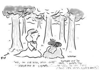
It’s a frog and a princess and the frog is explaining some piece of paper to her.
The original caption was "Before we do this, how do you feel about pre-kiss arrangements?"
It’s making fun of pre-nuptial agreements, but it’s not very good. Also, I’ve done one like this before, which didn’t occur to me until later.
Here’s the thing; I’ve already done the art, so I feel like I should try to salavge it with a new caption. The best I came up with involved me deleting the piece of paper in photoshop so the frog could say "No, an air kiss just makes me a lizard." And I actually did change the art and typeset the caption, but it still struck me as bad, so I deleted it all.
After three months, I’m pretty much ready to throw this in recycling.
Here’s another:

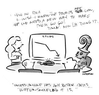
The original caption was "Unless anyone has any better ideas, wiffensnoofling it is."
The idea was to put a Seuss-like character into a business setting.
Ahem.
Again, all drawn up, and then it just laid there. I tried another caption, "I have no idea, why profits are low, we need a new way, to make them go go. Dang! Now I’m doing it!"
I really tried to come up with a generic Seuss look to the character, but I don’t think it turned out very well.
Ugh… Time for these two to go. Bad cartoons, I cast you OUT!
Technorati Tags: andertoons, cartooning, cartoonists, cartoons

I'm not very familiar with Dr. Seuss characters, so can't comment on the second one. But I do like the air kiss gag. I think you should keep it.
Also, I just asked this question to Mike on his blog, when you send your work to magazines like HBR and RD, do you write your captions manually or typeset on the computer?
I like both of these drawings! I've had the same thing happen to me as well: cartoon believed to be funny in the rough sketch, cartoon continues to amuse as cartoonist inks the finished drawing, but then comes the WHAT THE HELL WAS I THINKING??? moment when you look at it and start tinkering with the gag.
I have no advice — and no good lines, all I can do is commiserate. But I do love the drawings.
I wanted to announce that BSI is hosting a debate on http://throwthebsflag.blogspot.com/ beginning October 1, 2007. We are inviting Bloggers from each end of the political spectrum to comment on the political cartoons we are posting daily. Feel free to express your opinion. Send an email to bs.industries@hotmail.com with the address to your Blog and we will post the link under “Links to Participating Blogs.â€
Thanks for the commiserating, guys. Both hit recycling today.
Ahhh… That feels better.
As far as captions go, I typeset them, but I really have no idea if it matters or not.
I'd worry more about the captions' content than anything else.
Mark, thanks for letting me know. I asked that question because I know that it matters to the New Yorker.
Really? I had no idea Mankoff had a preference!
Hey Mikey, you know anything about this?
Mark, one of the contract cartoonists with the NYker whom I've known for couple of years told me that Mankoff prefers to see cartoons more targeted or tailored to the NYker and he personally doesn't like things like typesetting captions, giving numbers to cartoons etc. My guess is that he likes to see more of original stuff and he wants cartoonists to focus more on the NYker and not look like we'll just submit to any other magazine if the cartoons didn't make in the NYker.
Last time I met him in the NYker office, he said not to do gray washes on the computer. I'm meeting him again next week in NYC on a 'look' day. I'll ask his opinion on typesetting the captions. Contrary to popular opinion, I find him very encoraging and the best thing that could happen to cartooning in recent times.
I gotta admit, I stopped seriously chasing the NYer some time back. Good luck with him!