Custom Cartoons – A Look Behind the Scenes

I’ve written about custom cartoons and the creation process before, but I thought I’d go a little deeper this time and show you not only what I’d normally present to a client, but all of the extra behind-the-scenes work that people never see.

(Note – what follows is an actual example of one of the custom cartoons I’ve created for the good folks at eQuest. A big thanks to John and his crew for allowing me to use it here!)

Writing

It all starts with an initial idea from the client:

Person looking in utter frustration at an elongated computer screen with the term “Big Data Dashboard.” Screen should show an abundance of graphs, pie charts, a volcano blowing, fireworks, whatever…. Caption should read “NOW WHAT?”

He goes on to explain that the basic idea is…

“…that the dashboard contains WAY too much information to make a calculated decision. eQuest is developing non-dashboard like tools that make it extremely easy for users to utilize Big Data without actually realizing it. We want to make the point that you don’t need nifty looking dashboards to employ the use of statistical information.”

What happens next is I email over three or four ideas ideas to choose from. Here’s what I sent back:

1) Person looking at “Big Data Dashboard” on computer says to co-worker looking on – “This graph looks positive, the pie chart points to negative, but as for the animated hula girl or the spaceship, your guess is as good as mine.”

2) Frustrated employee looking over shoulder of frustrated co-worker at trying to make sense of over-complicated “Big Data Dashboard” on computer – “Try clicking on Bells, then go to the Whistles panel. After that you’re on your own.”

3) Big Data dashboard salesman looking at laptop with overwhelmed and confused potential client “It’s everything you need to know broken down into 37 bar graphs, superimposed onto 12 real-time line graphs, coordinated into 9 3-D pie charts. Now if you’d like to dig down…”

4) Disheveled manager to people in meeting looking at Big Data Dashboard being projected onto screen – “After careful consideration of all 437 charts, graphs, and metrics, I’ve decided to throw up my hands and go on a week-long bender. Who’s with me?!”

The client chose #4, but what he didn’t see were these additional ideas that I filtered out for various reasons:

a) Person looking at display showing large amount of confusing “Big Data” says to consultant – “I dunno, Tom, maybe we’ll stick with Little Data a while longer.”

This is sort of low-hanging fruit trading Little Data for Big Data. It’s too easy but it clears the way for better gags.

b) Giant laptop is menacing a city. Terrified resident points and yells “Oh no! It’s Big Data! RUN!”

It’s fun, but off topic. The client wants something that shows how confusing a crowded dashboard can be, not how scary Big Data can be.

c) Person in drive-thru is asked – “Would you like Big Data with that?”

I was thinking of Big Gulps, Biggie Fries, etc… Again, now it’s out of the way.

d) Consultant to overwhelmed client looking at massive amount of data on screen – “Oh, that’s just the Medium Data. We haven’t even gotten into Big Data yet.”

More playing on Big vs. other sizes. This is junk.

e) Person with glasses looking at screen crowded with massive amount of tiny info says to consultant – “For Big Data, that’s a pretty small font.”

OK, but it’s more a joke about legibility instead of content.

f) Consultant says to co-worker re: client who’s eyes are rolled up in his head and is drooling – “The bigger the Data, the harder they fall.”

Almost made the cut, but, again, it’s more about how Big Data can be overwhelming instead of confusing ways that Big Data can be presented.

I also came up with some weird half-ideas like a giant Data from Star Trek, something about a sack labelled “Bag Data,” and giant anthropomorphic numbers in a waiting room.

The point is, for every few ideas a client sees, there are usually 5-10 additional ideas that I don’t like and reject. I only want to present the very best I can come up with.

Sketches

So we’ve chosen the gag for our custom cartoon, which, after some additional back and forth, now reads:

“After careful analysis of all 437 charts, graphs, and metrics, I’ve decided to throw up my hands and go on a week-long bender. Who’s with me?!”

Next I draw up a pencil sketch so the client can get an idea of what the final cartoon could look like. Here’s what I sent over:
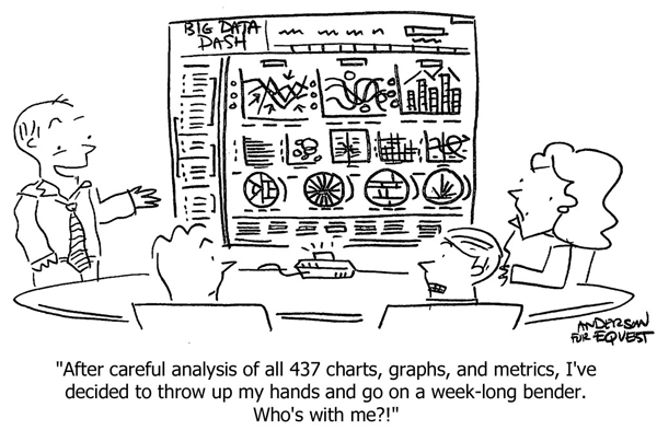
Custom Cartoons 2

But what the client sees as the first sketch isn’t really my first take. Here’s the actual first sketch:
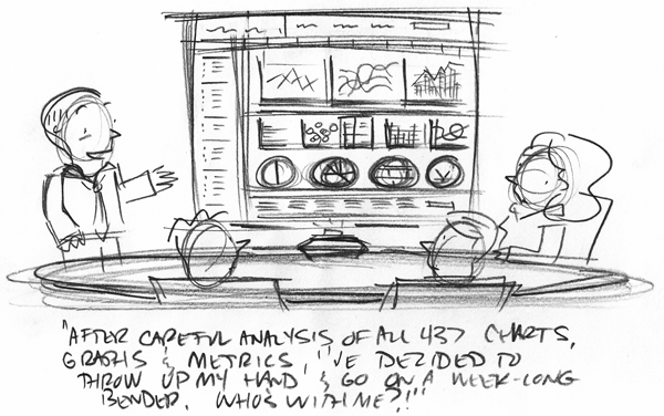
Custom Cartoons 1

When I started doing custom cartoons, I’d have sent this over to a client. It looks OK, everything’s basically there, and the client should be able to see past any little imperfections, right?

Wrong. What I see in my mind’s eye with that rough sketch is totally different that what the client sees. Sure, a sketch like this saves me time at the drawing table, but it wastes the client’s time by asking them to interpret something that is incomplete. And, frankly, it also often makes them a little uncomfortable about my artistic abilities.

So I draw up another ‘clean sketch,’ and that’s what I present to a client. Here it is again:

Custom Cartoons 2

The client liked the sketch and asked only for a few small changes – put the presenter’s arms up, and add “Big Data Dashboard” to the top of the screen. Can do.

Here’s the revised sketch:
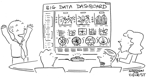
Custom Cartoons 3

So at this point I’m done, right? Not quite.

Research & Revise

A follow-up email from the client:

I showed it to several people – and don’t freak out – but I actually got people asking me what “bender” meant.

Am I getting old? Bender is a great word.

Changing it to a “…week-long drunk…” isn’t as good.

Thoughts?

My first thought is this is a really great client; he’s totally right, “bender” is great. But if it’s not as universal as it used to be, I need to come up with some options.

I could rattle off a few “drunk” synonyms off the top of my head, but custom cartoons can often hinge on just the right word, so I do my research.

Thesaurus.com offers up some good choices:

  • Tipsy
  • Crocked
  • Lit
  • Plastered
  • Sloshed
  • Tanked
  • Three Sheets to the Wind

Not bad, but none of them are quite right. I try another source:

  • Blotto
  • Cucumbered
  • Hammered
  • Pie-eyed
  • Wrecked

Good choices (especially “blotto”), but I still don’t have it. So I keep trying various sources until I finally come across what I think is the perfect word: 

  • Snockered

I run this new caption past the client:

“After careful analysis… I’ve decided to throw up my hands, hit the liquor store, and get snockered. Who’s with me?!”

It’s approved and I can move on to the final art.

Ink & Shade

When I ink I work quickly to keep the artwork looking like it was just dashed off. (Nothing kills the fun in a cartoon like a too-careful line that just lays there.) So as I go I write little notes to myself. Usually they’re things for me to fix in Photoshop or little reminders of what the client wanted:
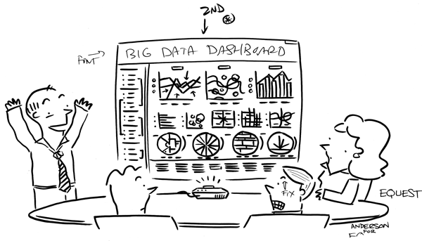
Custom Cartoons 4
  • Use a font for the “Big Data Dashboard” at the top.
  • Resize the second pie chart slightly to bring it in line with the others.
  • Fix the eyebrow on the front right character from angry to surprised.

Then I scan in the ink and go to work in Photoshop.

I make my fixes and do the ink wash. I shade in Photoshop using scanned markers because it allows me to keep a more organic feel to the art, while giving me an Undo when I need it.

Final Art

Here’s a look at the final art the client received:
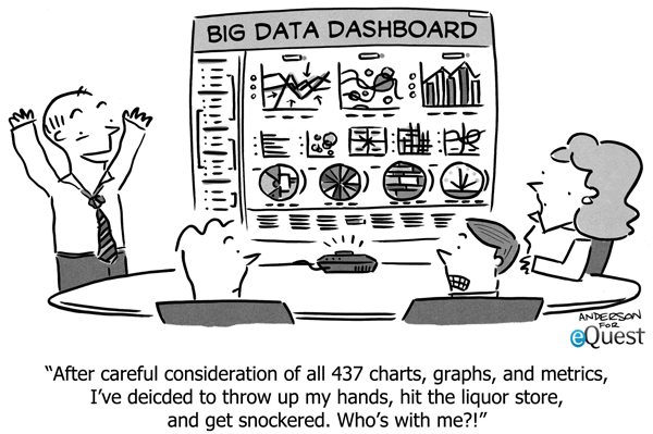
Custom Cartoons 5

The scene and characters read cleanly, it gets the point across quickly, and it delivers a laugh all in about seven seconds. It’s a great addition to a blog post, but could also be used in to pep up a presentation, add some visual interest to a newsletter, or drive traffic via social media.

I retain a copy of all the custom cartoons I create as backups, but I also keep the Photoshop PSD broken into layers (ink, shade, text) in case the client needs to make changes in the future or wants a color version.

I try to keep the client’s experience in creating custom cartoons as easy and enjoyable as possible. And although it takes quite a bit of effort behind the scenes to pull that off, crafting something really great for the client and their audience is totally worth it.

If you’re tired of stock photos and infographics, you might give custom cartoons a try. They’re the perfect complement to your content.

FYI, here are some additional articles on custom cartoons:

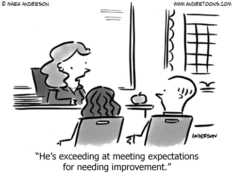
20 Education Cartoons For Back To School

Kids and teachers all across the country are getting ready for a new school year. (WOO!) So I thought I’d help get everyone in the mood with some education cartoons!

Enjoy:

Education Cartoon 6431

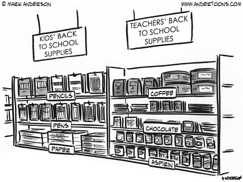
I’m sure I’ve mentioned it before, but my wife is a teacher, and believe me, this cartoon is fairly accurate.

Education Cartoon 6451

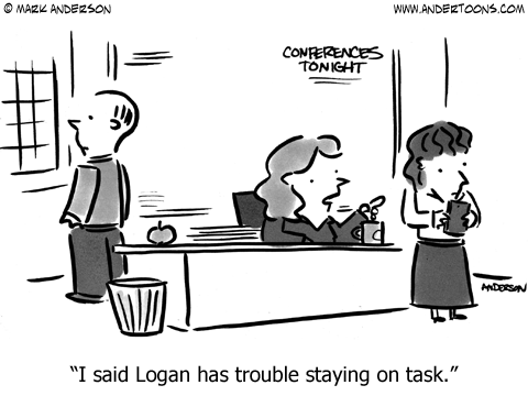
I don’t know if it’s the case anymore, but when my kids were born it seemed like every boy was named Logan. I knew Wolverine was popular, but sheesh!

Education Cartoon 6457

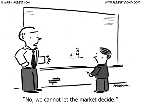
You just know that kid is going to grow up and crash the entire financial system one day.

Education Cartoon 6463

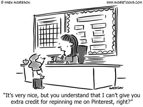
This education cartoon was really really popular about a year ago. Is Pinterest still a huge deal?

Education Cartoon 6470

I’m really happy with how this cartoon sort of steps down from positive to OK to uh-oh in only 8 words.

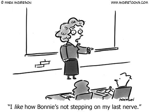
Education Cartoon 6481

My wife uses that phrase a lot. For example, “I like how (insert name here) is paying attention.” It works like gangbusters usually, and I had fun playing with it a bit.

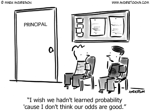
Education Cartoon 6490

Ignorance is bliss, especially with math.

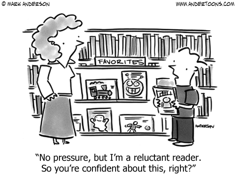
Education Cartoon 6494

“Reluctant reader” is another phrase I hear my wife say, and it was fun to see f I could make a cartoon out of it. Also, those books in the background were fun to draw.

Education Cartoon 6510

For a while it seemed like infographics were everywhere, but they’re either dying down or I’ve seen so many I’m ignoring them now. I suspect the latter.

Education Cartoon 6528

This education cartoon came out around Valentine’s Day, and it’s one of those where you wonder what the back story is. At least I do.

Education Cartoon 6536

I disagree.

Education Cartoon 6548

I was sure someone had done this cartoon, but I searched online and never found it. Still, someone’s had to have done this already, right?

Education Cartoon 6553

I’d like to read that sentence.

Education Cartoon 6554

Most of my education cartoons are based in elementary schools, but I do try to do more high school themed cartoon occasionally. 

Education Cartoon 6562

PLC is the acronym for Professional Learning Community. According to Wikipedia they are:

…an extended learning opportunity to foster collaborative learning among colleagues within a particular work environment or field. It is often used in schools as a way to organize teachers into working groups.

My wife really likes it, and it was a fun challenge to do a PLC cartoon, but if you don’t know what that is, then this probably isn’t that funny.

Education Cartoon 6586

I tried to make the two handwritings different in this, but even my left-handed penmanship isn’t too bad. Sigh…

Education Cartoon 6603

This field trip cartoon was so much fun to draw, and I got to work in comic books to boot! WOO!

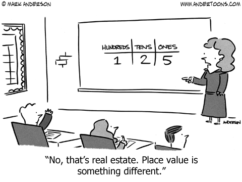
Education Cartoon 6652

Place value is one of those terms I think you forget about later in life. Unless you marry a teacher that is.

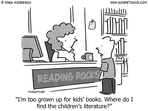
Education Cartoon 6690

I try to vary my education cartoon cast to include nurses, counselors, and, in this case, a librarian.

OK, last one…

Education Cartoon 6432

So that’s it! Hope you enjoyed these education cartoons, and hope you have a great school year!

109

109.

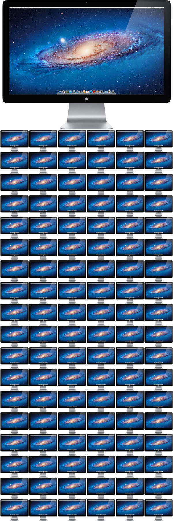
That’s the number of Apple Thunderbolt 27″ hi-res displays, each maxed out at 2560 x 1440 pixels, you’d need if you wanted to simultaneously show every web-ready cartoon you get with an Andertoons Pro Subscription.

Here’s what 109 displays stacked neatly looks like:

Cartoon Subscriptions 1

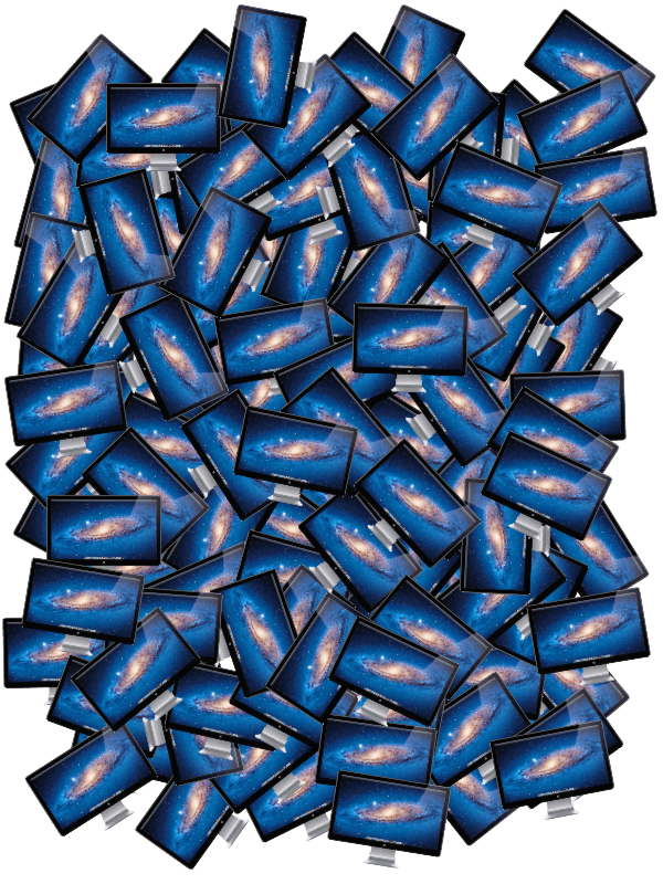
And, just for fun, here’s what 109 displays looks like in a big messy pile:

Cartoon Subscriptions 2

With an Andertoons Cartoon Subscription you get thousands of cartoons you can use to grab attention in websites, blogs, Facebook, Twitter, Google+, and Pinterest and more, starting at just $20 month.

Try one out today!

(I’d show you the number of displays needed to show each hi-res cartoon you’d get with an Andertoons Premium Subscription, but that would mean cutting and pasting over 1000 displays in Photoshop. And I’d rather draw up some new cartoons.)

Cartoon #6673 Sketch to Ink

Lately I’ve been testing out a new setup for getting video of me working. Let me know what you think:

Video transcription:

Hi there. This is Mark Anderson from andertoons.com and I’m going to show you how I sketch and resketch and ink a cartoon from beginning to end. So, here we’re starting with the first pencil sketch. The cartoon I’m going to be doing is a medical cartoon where a guy is at the doctor and the doctor is giving him some advice. So, you can see I start with a circle there for the head and I’m drawing the legs. I go pretty fast with the initial sketch because I like to try to keep it real lose and real easy and I know that I’m going to do a sort of cleaned up version of this for myself later on, so I’m not super worried about how things go or erasing or changing things in the first sketch. So here he is on the little table. I got to say, this isn’t one of my favorite scenes to draw because it’s sort of a weird angle but I haven’t quite figured out a good way to do it yet and get the idea of being in that waiting room at the doctor. Okay. Here’s the doctor, I am putting a little bit different hair on him. I didn’t draw the rest of the guy’s legs over on the left because I’m planning on cutting the scene off there. I’ve drawn the scene a lot so I know that I’ll probably cut it off right there so I don’t even go all the way down and you can see I’m not even worrying like I’m drawing his arm right over the rest of him. Again, this is a very, very quick sort of dirty sketch. This part it only takes a few minutes. So see I’m sort of framing it in there, I’m sort of framing it and putting in some more details, making things a little darker for myself. I don’t know if that line over there is the one for the patient’s other arm. What am I doing? Oh, I’m giving him… oh I changed it into a gown. It’s been a little while since I looked at this. For a second, I thought I was giving him really long arm. I’m changing it to a gown because I hate drawing; the guy is in a boxer shorts at the doctor because it’s sort of a weird angle to draw the shorts from with the legs coming out. Yeah. That’s right, so I changed this to a like a gown. Like he got into a gown to be examined and I’m just finishing some… I don’t really need to sign this first sketch; I don’t know why I’m doing that but all right.

We’re going to be moving on to the cleaned up sketch here in just a second but there is one last look at the rough sketch and here we’re back. There…now, I’m turning on my light desk at the table there and getting my couple of pieces of paper lined up and trust me, it will focus here in just a second. So I have a drawing or drafting table and then I have a real flat light desk that I keep on top of it and then I use my giant hand there to keep you from seeing things. Now, I’m doing the clean-up sketch, this is like another chance for me to work on things that I liked and didn’t liked in the sketch before I ink it. I don’t necessarily need to do this but I find it over the years that it actually saves me time to do this sort of cleanup sketch even for myself. I do this for clients a lot because if you show a client that rough sketch, that beginning sketch and you say, “Well, here it is. What do you think?” They’re all like, “Oh… it’s terrible”. So you can’t show them, you have to show them a cleaned up sketch and I found over the years that doing a cleaned-up sketch for myself like this moves things along because you leave it real rough and then you go right to ink. At least for me, I find little problems then and I end up inking two or three times sometimes on a complicated cartoon. So over the years, I’ve just gotten used to doing this sort of like resketch for myself.

So basically, I’m tracing but I’m trying to trace quickly and lightly and I’m not…again, I don’t want to get bogged down in all kinds up nit-picky details because then you sort of leech the life out of the cartoon and I don’t want that. I want it to look sort of dashed off like I just sat down with my pen and ink and just went… oh look, oh the cartoon just flows, who knows where they come from. You want it to look like that but it doesn’t ever work like that. So there’s the finish clean-up sketch and I’m turning off the light desk so you can get a better look at it and focus, focus.

And so there is the rough sketch. It’s sort of messy and there is the cleaned up sketch for me. Rough sketch, clean up sketch. Rough sketch, clean up sketch.

All right, now what I’m going to show you is I take this cleaned up sketch and this is mainly because I’m getting old and my visions isn’t what it once was. I take this cleaned up sketch and I scan it… oh, it’s big. I scan it in, I have a little self-feeding scanner so I take this sketch here, I scan it in and then I blow it up. I print it out at about, I don’t know, 150%, something like that and then this is what I’ll do the ink off of. I used to… upside-down cartoon. See, I use the same piece of paper to do a bunch of cartoons. So yeah, up there at the top you see the other cartoon that I was working on upside-down. Now, I’m taping this on… taping my ink paper onto the sketch here so that it doesn’t move on while I’m working on it.

Yeah. I generally work small but I found—like in the past year, I need to work bigger but I don’t sketch big and I like my sketches to be what they are and I don’t want to change how big I sketch so I found the way it works for me is I don’t worry about anything what I’m sketching and then once I’m done with it then I blow it up to a size that I feel comfortable inking so that way I feel like I’m staying true to the original sketch but then I can draw something that I can see and the line isn’t like an inch thick when you’re done.

So I’m doing some inking here. You see I move pretty fast. I’m not worried about getting every line exactly as they were on the sketch. The sketch is sort of a guide more than anything and I’m just trying to move fast and loose and again keep that spontaneity in the final art that I have in the sketch hopefully. Now, this is of course like the third time I’ve done this little piece so every time, it becomes a little clearer and a little more finished but I really don’t want it to be dead on the page so I try to move fast and easy and just keep it fresh. There, I’m drawing the tie, putting in my little details there. All told like to do the first sketch and then the second sketch and then going here to ink. This video clock saying it’s just about 9-½ minutes. Of course, there’s time for scanning stuff in and I still need to shade it, I’ll do that in Photoshop. I used to do it with markers but I found now that I’m working bigger with my inks, it was taking so much time with the markers and I was using so many markers so that’s another thing that’s changed recently as I do all of my shading in Photoshop now. I recreated my markers, my Prismacolor markers into like an endless pattern in the different percentages and Photoshop and that’s what I use for shading now.

It looks pretty good and I try to keep that as organic as possible. Here’s that gown again, it’s looking pretty good and there’s his legs coming down. I don’t like to draw a feet so if I can cut that off so I don’t have to draw feet. I’m doing it, I am cheating. I am terrible at feet so unless I really have to draw them, I don’t.

So, it’s looking like a pretty good scene, just about done here. Need to add my signature. Hope you enjoyed this video. If you… you can check out this cartoon on my website. I forget which number it is but just look under medical or doctor and you’ll see it. And here it is, I’m turning off the tracing and there you go. So hope you like it, andertoons.com.