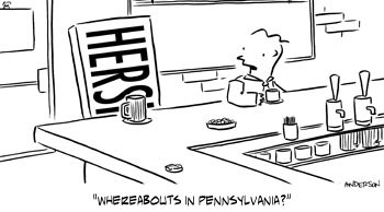
On advice from a few readers, and my wife, I’m trying a slight change in the cartoon:

I took the face off the bar and just have text there now. I think it’s an improvement.
But now that I look at it, it looks like it says “HERS” like one of those His/Hers towel sets you see on the old cartoons.
Maybe tighten the text to see more of the second “H”?
I dunno… Any thoughts? I think I’m thinking too much about this…
(BTW, here’s Chocolate Cartoon Part 1 & Part 2)
Technorati Tags: andertoons, cartooning, cartoonists, cartoons

Mark,
This cartoon is good as is, but if I were you, I think I'd draw the same cartoon like this-
http://www.toonbag.com/hersheys.gif
M,
1. Glad you went with the PA gag idea.
2. It's better w/o the face.
3. Leave it alone.
The comment above offers an alternate perspective that reveals the entire word. I think part of the joke is that it's obscured and you have to think for a split second to figure it out.
Jason Kranzusch
Srini – Nicely drawn, but I think I'll keep it this way. I like seeing the bar first.
Jason – I like you because you're right on all three counts. 🙂 (Thanks for the input!)
Any other thoughts out there?
Srini, I took another look at yours just to be sure of what I wanted, and here's why I did what I did:
1) I wanted to anthropomorphize the bar by having it sit on the stool.
2) This angle allows the bar to face forward toward the bar/drink.
Normally I'd also shade the bar (dark wrapper with white letters like the actual bar), but I'll explain why I didn't later…
What if the bar was wearing a hat? Arms?
Hats are a liitle 1950's for me… Maybe arms…
I think I'm gonna call it good.
I'll have more on this later though…
What if the text was white on black, like on the real thing?
But I like it as is, and I got it immediately, so nevermind.
Yeesh, why didn't I think of that… OK, I'm gonna try the white on black.
More in a day or so…
Here's a thought, too: there is one detail the Hershey bar is missing. The wrapper ends. It looks like a solid rectangular bar. But some of the candy bars themselves have the silver part peaking out behind the main wrapper. Others have the 'cut off' style on either end (with the little triangles cut).
Like here:
https://www.sweetfactory.com/images/50159.jpg
Or here:
http://www.english-shop.net/catalog/images/hersheysmilk.jpg
Just a thought.
Wow. Talk about cartooning by committee!
Hey Chip! I thought about that, and I even bought a number of chocolate bars to reference. (Oh how I suffer for my art!)
But I think I want to keep it vague whether you're looking at the bar itself or the packaging.
Anyway, thanks for the input. Check out Part 4; I just posted it.