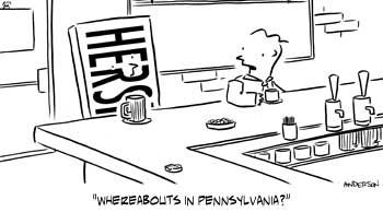
You might remember that last week I was working on a chocolate bar themed cartoon.
Here’s the final art for it:

Normally I do my standard gray wash, but this one just needed to be line art.
I think the biggest issue for me on this one was the face on the chocolate bar. How much of the lettering to remove?
After about a half hour of playing with it, I think it came out OK. It”s there for anthropomorphic purposes, but the lettering is still clear.
I also normally crop a little closer to the characters, but there’s a reason for that too.
Anyway, I’ll have more to tell you about this cartoon later… Stay tuned!
Technorati Tags: andertoons, cartooning, cartoonists, cartoons

I like it!
Thanks! I'm pleased with it.
I dunno about the face in the candy bar. It took me a minute to even figure out that it was there. It looked like a few excess lines. If I were you, I'd loose the face. I think the bar stands on its own pretty well.
Ya think? My wife said the same thing, but I think I talked her out of it.
Let me try it without the face and I'll post it for closer inspection…