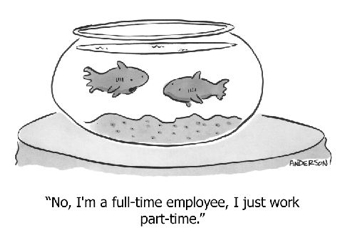
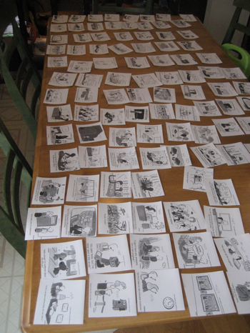
OK, there’s still some tweaking o do here, but I took a lot of advice and here’s what I’ve got now:

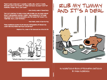
This is, of course, the entire wraparound cover. And it’s even got the new Andertoons logo on the spine!
I changed the font from Tahoma to my Andwritten font, and I have to agree with Mark, it looks better.
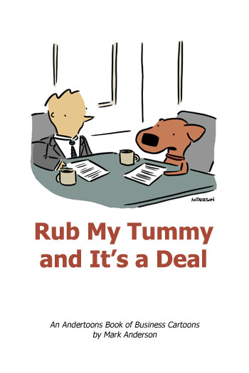
I’d also considered doing the cartoon larger, but I’m gonna stick with my strengths here and go with a simple panel cartoon.
Whatcha think?
Technorati Tags: andertoons, books, business, cartoon, cartooning, cartoonist, cartoons


