OK, so how’s this?
Technorati Tags: andertoons, books, business, cartoon, cartooning, cartoonist, cartoons

The cartoon blog of Andertoons cartoonist Mark Anderson. He discusses his cartoons, cartooning, comics and, oddly enough, LEGO.
OK, so how’s this?
Technorati Tags: andertoons, books, business, cartoon, cartooning, cartoonist, cartoons
Comments are closed.
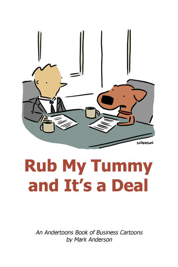
If I were pulling the Anderson strings, I'd put the title at the top, using a more cartoonish font, something light-hearted, and I'd redraw the cartoon to fill the cover. Follow the lead of Watterson and Breathed — they'd put a full color version of an interior panel on the cover (a moment from a daily), something splashy, to catch attention. (for example, the cover art for the second spot book illustrates something implied by one of the strips, but never shown — it's a bonus for the reader. Think of the cover art more as an illustration, rather than a panel cartoon (phrase trademarked 2008 by Mark Heath) with spot art. Either draw more of the office, or print the cartoon larger. That's what I'd do.
There's my two cents. spend it wisely.