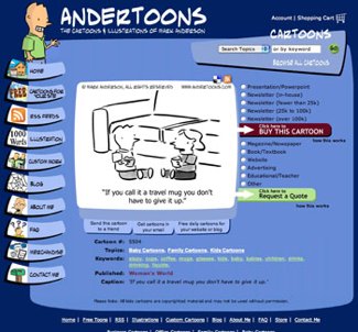
Andertoons 2.0

Yes, the new Andertoons.com is live and working!

Ahhhh…

After about six months of planning and design, and several weeks of expert coding from my web team, we seem to sailing mostly smoothly.

I know of a few little problems I’m working on ironing out, but, for the most part, you probably won’t notice them.

Tomorrow I’m beginning a month long look at new features that I think you’ll really find interesting. There’s so much new stuff under the hood you just won’t believe it.

Anyway, go check out the new site, rate some cartoons, add some to your faves, etc… Enjoy!

Technorati Tags: , , , ,

Brain… Hurting… Must… Sleep…

Hooboy, the past week or so I’ve been buried in IM, PostgreSQL, XML, CSS, CSVs, and various other techie acronyms.

The new site is over the hump construction-wise, and there’s a lot to consider, reconsider and refine. My programmer and I are IMing back and forth a lot, and while it’s invaluable to be looking over each others’ shoulders from a few states away, it does eat a lot of time.

I’m also pretty sure I’m driving my wife insane. I’m obsessive anyway, and you get me in the middle of a web build, and…. KAPLOOEY! I’m a handful.

Anyway, it’s really gonna be exciting to launch the beta in a few days – you won’t believe what we’ve cooked up!

More… later…

Coffee… running… out…

Technorati Tags: , , , ,

About Me 2.0

So I’m putting the finishing touches on the new website, and one of the page that’s desperately needed an update is the About Me page.

This sort of thing is always uncomfortable for me. Do I use a photos of myself? A caricature? Do I show myself at all? Will anyone care? Why am I here? (Oops, too far…)

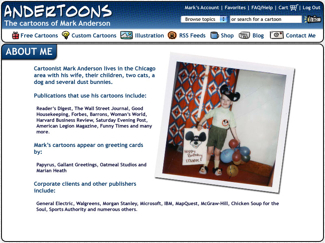
Anyway, I finally decided on a photo, but as you’ll can see, I used one from a few years ago to make myself seem a bit younger. (Click the image below to see the entire new About Me page.)

Aboutmel

Technorati Tags: , , , ,

Andertoons Redesign (I Just Can’t Leave Well Enough Alone)

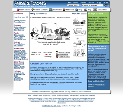
It’s been a few weeks since I last looked at redesigning the site, and after looking at the last design with some fresher eyes, and spending WAY too much time drawing graphics for the left side buttons, I scrapped everything yet again and started fresh.

Drum roll please…

Andertoons2-1

(Click the image to enlarge to 1024 wide.)

OK, the buttons on the left are gone. I’m sorry, but there was just no way around it.

As the site expands and provides more and more features, screen real estate becomes harder to juggle. I’m also trying to leave some “white space” to avoid feeling too crowded. But, never fear, I didn’t get too Web 2.0/corporate; dig the little icons in the top horizontal menu bar.

I also did some new stuff for features underneath the cartoon.

Hopefully it stays playful while allowing me some more room to work.

Of course there’ll be more pages to change, but this is the final design and will define the rest of the site.

It’s still a few months away, but I was excited to show it off.

Hope you like it!

Technorati Tags: , , , ,

WWYD?

I’m doing some tinkering/cleaning under the ol’ Andertoons.com hood, and my programmer asked if I wanted to make any design changes while he was in there.

Apparently the changes are wide-ranging enough that redesigning the look of the site wouldn’t add to the cost. (Yippee!!!)

I’ve been dreaming about doing this for a good long while, and this is the perfect opportunity.

So, dear readers, what would YOU do?

What parts of everyone’s favorite cartoon website would you like to see changed?

Color scheme? Layout? Fonts? Lemme have it!

Lose the waving guy? Trash the animated menu? Get all Web 2.0 on it? I’m open to anything!

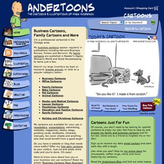
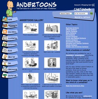
Here’s some current screen shots to get you thinking:

Andertoons


Andertoons2

Andertoons3


Please don’t make me design the new site on my own! HELP!

Technorati Tags: , , , ,