So here’s the first of what I’m hoping will be a daily thing this month about the new and exciting changes at Andertoons.com. (Sorry for the late post; lots of illustration work and short deadlines.)
I think the first thing anyone who’s been at the site more than a few times will notice, is that it just plain looks different in every way.
Because we were completely gutting and rebuilding the site’s infrastructure, we had an opportunity for a facelift. May as well go whole hog, right?
Plus, I’ve really been a fan of the clean simple Web 2.0 design of recent years, and had been itching to do a site in that style.
What was interesting, however, was how poorly my initial concept for the site was received. It seemed that all that white space and clever typography was fine for say a Flickr, but a lot of folks advised me not to lose the fun cartooniness of the current site.
I really sort of just fumbled around in different designs for a few months, before I hit on something that I thought balanced the clean usability of Web 2.0, and what so many people liked about the old site. And that, obviously, is what the site looks like now.
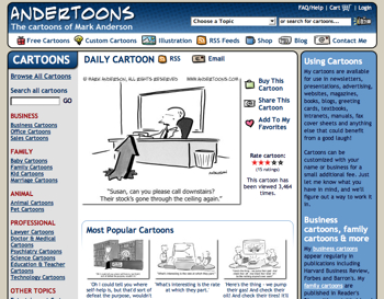
I did want to bring over some elements from the last Andertoons look – the rounded rectangles (I was into ’em before they were cool!), much of the color scheme, some Andertoons-esque icons – but I needed to move an awful lot around to make way for a lot of new features and content.
One big way in which I differ significantly from the Web 2.0 look, is the outline around the pages’ elements.
I’d initially rejected this look, but the more I looked at my cartoons, and the thick line I like to use, it began to feel like the way to go. Also, it helped separate text heavy sections of the page more clearly. (At least that was the idea.)
Another huge difference is the loss of the rollover navigational icons on the left side.
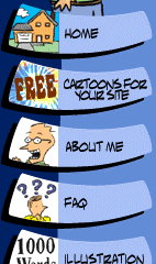
Many many people wrote to tell me how much they liked those (and that little waving guy at the top), and I had to admit they were a lot of fun, but when it came right down to it, there just wasn’t enough space.
I compromised again by adding a little icon next to each link in the header’s navigation.

I was surprised how long they took to get just right. Using a thick link in a small space, and making the image simple and recognizable in my style… Well, let’s just say I have a whole new respect for folks that do that for a living.
Anyway, I could go on and on about design minutia, but suffice it to say, I worried about pretty much every pixel right up until the launch (and a little after).
Let me point out, I’m no graphic designer. I really don’t have any art training, and my coding skills are abysmal. Pretty much I’d figure out all the elements I needed, drop ’em into Photoshop and move stuff around until I thought it looked OK. So, I can pretty much guarantee I’ve violated a number of design rules and practices, but overall I think it looks pretty good.
I hope so, because my Web 2.0 design itch has been well scratched, and I’m not changing anything again for a long long time.
Hope you like it!
Technorati Tags: andertoons, cartooning, cartoonists, cartoons, web

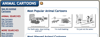
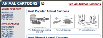
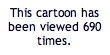 Another brand new feature is Andertoons keeping track of cartoon views.
 We have a lot of brand new features at
  OK, short blog today because it’s Friday and I need an afternoon off, but check out the new