
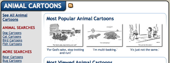
One of the maddening things about a new web design is trying to figure out where users might look for things they want. Here’s a perfect example of something I’ve spent entirely too much time on this afternoon:
I want to make it easy for users to get to search pages where they can see all the cartoon in the topic of their choice. In this case, animals.
So, do I put a link on the left above the other links (look above “ANIMAL SEARCHES”)…
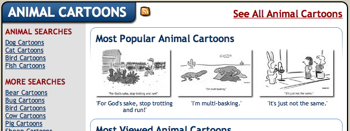
…or at the upper right in a larger red font?
I’ve considered add topic searches to the main pulldown menu…
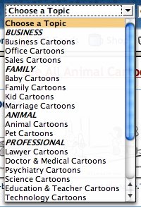
…but it’s already crowded in there.
I’ve left both examples live on my animal cartoons page. Any ideas? Opinions? Thoughts? Haikus?
Technorati Tags: andertoons, cartooning, cartoonists, cartoons, websites
I spent seven minutes studying the page, and I reached this conclusion: anyone interested in buying cartoons will make the time to consider the page thoughtfully, and the link in the upper lefthand corner is perfectly clear. I don't think the righthand link is necessary.
You know, the more I tinkered, got some time away, tinkered some more, convened a seance, etc… I think I've come to the same conclusion.
Plus I don't want to seem whorish with big red text.
ROX-anne…