Memory

MemoryLast weekend I installed two new gigs of memory in the ol’ iMac (G5 Power PC for those of you playing at home). It was the first time I’d tried doing anything hardware related with either of my Macs besides plugging in some more USB devices.

It was remarkably easy to do, and purchasing non-Apple memory and installing it myself saved me a boatload!

So, a big thanks to Baby Blues artist, Mac aficionado, and all around great guy Rick Kirkman for the advice and encouragement!

Technorati Tags: , , ,

AnderTwitter

Lately I’ve been trying something out called Twitter. It’s kinda like blogging, but in tiny tiny snatches.

Basically it revolves around this one simple question – “What are you doing?”

Throughout the day whenever I’m at the computer (you can also text or IM in entries), I type in a snippet through Twitterific. For instance, I just Twittered “Blogging about Twitter.”

I’ve installed a widget on the left sidebar so you can follow whatever the latest is. Here’s Sunday morning at 7:46 AM:

Twitteratblog


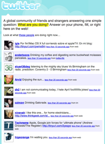
And here’s what it looks like at Twitter:

Twitter746Am

I can’t promise it’ll be exciting, or insightful, but I feel good knowing that Big Brother can take a few minutes off to get a cup of coffee while I do his work for him.

Technorati Tags: , , , , , , ,

Amazon’s Emetrics Don’t Suck

AmazonOK, first off this data is at least three years old, but I still think it’s fascinating.

I ran across it at Web Pages That Suck (I looked for a permalink, but couldn’t find one.  Look for "When Simple Design Doesn’t Work").  It’s a PDF of an Amazon.com presentation from 2004 that discusses, among other things, Amazon’s A/B testing.

There’s some great examples starting on page 14 showing differences in their top navigation tabs, a scaled tab that never was, and, the most interesting part for me, a look at simpler pages vs. more crowded pages.

Now, if you believe the current Web 2.0 trends, which I like from a design standpoint, you’d think more "white space" and less crowding would be more attractive and, hence, more profitable.

Well, it turns out that for a retailer like Amazon with lots to browse and recommend, more is better.  Cart adds were down and abandonment was up.

Amazon is well known for leaving nothing to chance, and letting the numbers speak for themselves, so, looking back at my own redesign, I’m really glad I looked closely at how they organized their home page.

I’d love to do some intensive A/B testing when time and budget allows.  Not only would it yield some interesting results, I think it’d just plain be a lot of fun.

Anyway, check it out.  It’s pretty fascinating.

Technorati Tags: , ,

Andertoons 2.0 – New Filemaker Database

I love Filemaker.

I think the common conception of the artist is one surrounded by various piles of slovenly creativity.

Not me.  I’m a neat freak.  (OK, I leave dirty clothes next to the hamper in my bedroom, but that’s another blog…)  I revel in being able to take gobs of information and organize it into tables and layouts and such. 

So getting to design a new Filemaker database to match the data structure of the new Andertoons?  Heaven.

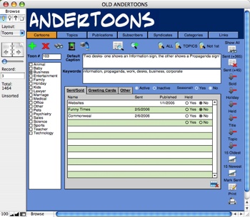
Here’s my old FM layout (click to enlarge):

Olddb

Not too bad for my first try, and it served me well for years.

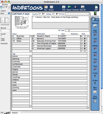
But here’s my new digs (again, click to enlarge):

Db2


Oh yeah…  That’s nice!

With Fliemaker 8.5, I can now pull the thumbnail from my site and see it live in the database instead of adding thousands of JPEGs to the database itself.

And each tag now has its own entry, instead of being a single field filled with comma-separated keywords.  (Notice how they alphabetize themselves?  JOY!)

I’ve also added some new buttons for myself at the top and side to speed repetitive tasks.

Everything I need at a glance.  And fun little icons to boot!

I’m such a nerd.

Technorati Tags: , , , ,

The Andertoons ChaCha

Ran across ChaCha again over at TechCrunch, and finally gave it a try. Here’s a transcript of my human guided search:

Status: Connecting …

Status: Looking for a guide …

Ring: …

Status: Connected to guide: joshua(79876)

joshua(79876): Welcome to ChaCha!

You: Hey there

You: I need some good business cartoons

joshua(79876): Welcome to ChaCha! Please wait a moment while I search for your results.

You: k

joshua(79876): Please be more specific as to what you’re looking for on this topic.

You: I just need some funny business cartoons for a presentation

You: Where could I purchase some?

joshua(79876): does it matter of what business the cartoons are about

You: Nope

You: Generic business

You: Sales and stuff

Then results started appearing in the right column:

Chacha

I waited until four results showed up. to continue:

You: Cool, that Andertoons looks good

You: Thanks!

joshua(79876): no probuno momento por favor

joshua(79876): lno problem

joshua(79876): anything else i can help with today

You: Nope

joshua(79876): k have a nice day and thanks for choosing chacha

joshua(79876): Please RATE ME. Thanks for using ChaCha.

Status: Session ended.

I rated the guide as “GREAT” even though the results I got were under the heading “Health > Conditions and Diseases”

ChaCha is interesting, but dreadfully slow in a “I’ll just Google that real quick” world.

Anyway, kinda weird, but nice being #1.

Technorati Tags: , , , ,