
Regular reader, Jimmy, wanted to see a little more of the inside of the Trib’s new comics section, especially the vertical Non Sequitur.
Here you go:
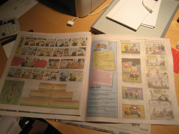
Sorry about the lighting and the general crumminess of the picture. I took it at 5:14 AM before my first cup of coffee.
I think NS holds up well. No idea if Wiley had to change anything.
Peanuts, however, doesn’t work so well vertically:
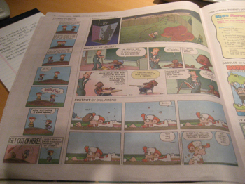
Kinda awkward IMHO.
Anyway, there’s a look inside for ya!
Technorati Tags: cartoon, cartooning, cartoonist, cartoons, comics
I'm glad that Martin didn't squeeze out the Peanuts frames to be all the same size. Then again, Martin doesn't do that sort of thing, cuz he does a great job with his work.
I agree – changing the Peanuts panels would be a sin, but the varying widths vertically, and the two panels at the bottom…
Then again, you're working with limited space and if something's gonna give, I'd use Peanuts too.
All in all I'd say the new section is a success.
Thanks for the "Non Sequitur" update. I remember the last Sunday Tribune section I got was in February 2000 (when the Comics front page had from top to bottom: "Peanuts", "Dick Tracy", "Mr. Boffo" and "Shoe". Boy was that a long time ago)which was three months before "Sequitur" went to the required vertical format. I always wondered how it would fit in a smaller size paper. Thank you!!!
No problem my man! Thanks for being patient!