
Thanks for being patient while I battled my sinuses for a few days there.
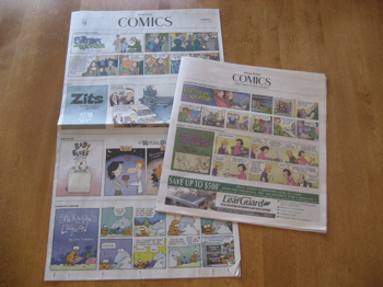
As promised, here’s the old Trib comics section (left) and the new one (right).
Looks like about the same number of comics, although they’re printed a bit smaller.
All in all I’d say it’s a nice new format, it’s a good size for kids’ hands, and including it with the TV guide may spur some readership.
Technorati Tags: andertoons, cartoon, cartooning, cartoonist, cartoons, comics
That's an interesting contrast. I wish I knew what the Trib did to "Non Sequitur". If it's still in the Sunday Comics, can you please show us how the Trib managed to fit "Non Sequitur" and its' vertical-only format?
I'll take a picture of it today so you can see…
D'oh!
I did something similar to this over on the Wisen, Mark! If I had visited your blog first, I would've waited for your version.
BTW – Non-Sequitur went from 13.5" tall to 10" tall. Still in it's vertical format.
No staples means the TV book will be a mess (petty, I know) and the comics are printed smaller and the design of that section is horrible. They had to print the title panels so you'd know you went from reading one comic to the next.
Anything to save money.
You know what's kind sad, is I actually don't read the comics hardly at all anymore.
I don't know if it's being a cartoonist and not being able to pull back and just enjoy them, or if they're just plain not as good as they once were, but it's just the way it's gone for me.
There's still a few I read online, but sittin' down with the funny papers? Not for a looooong time.