
So after getting my logo finished up, I decided I needed to update my stationary and business card too.
I’m using the same folks to to the design, but I’m not sure I like where it stands (click the image to enlarge):
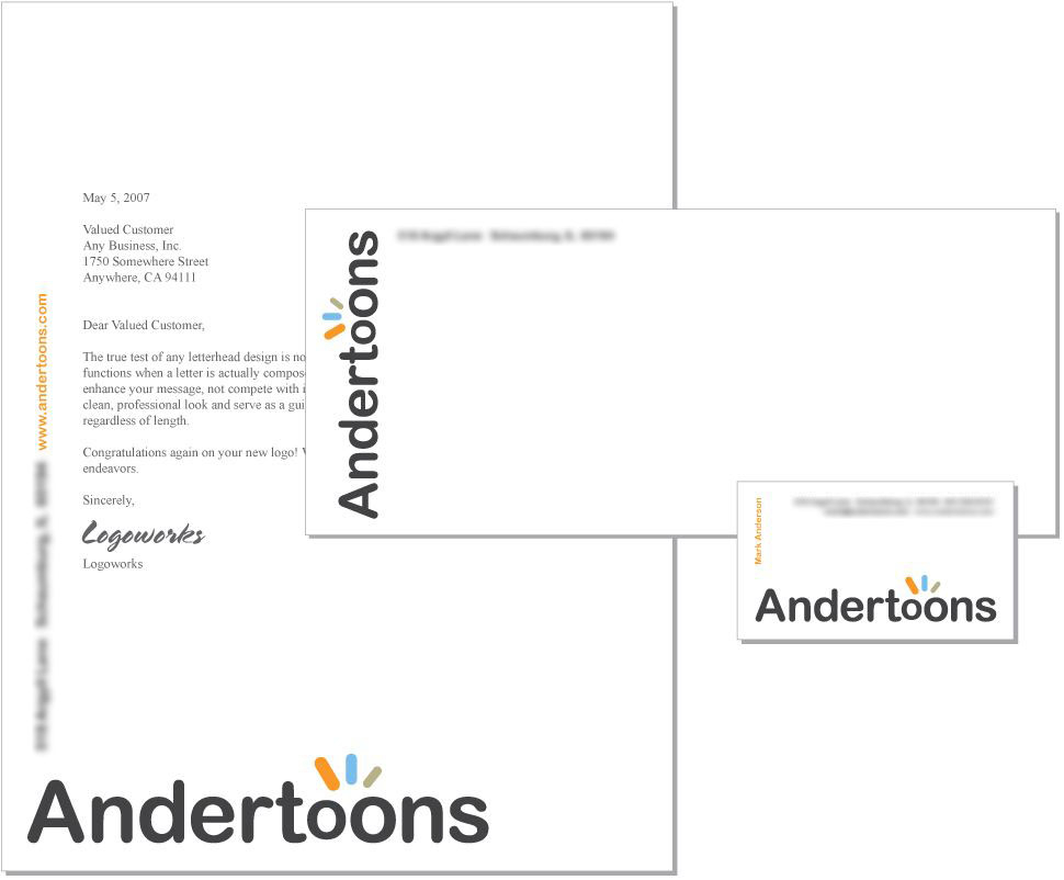
I’m thinking that “Andertoons” at the bottom of the paper is too large. And, as I said, I’m not sure I love this design at all really.
Any thoughts?
Oh, one more thing… I’ve considered putting a cartoon on the back of the business card. I was thinking this one. Probably redrawn.
Any other thoughts?
Now, any limericks?
Technorati Tags: andertoons, business, cards, cartooning, cartoonists, cartoons
Love the cartoon! I wish I had thought to put one on the back of my card (I just my business cards from Overnight Prints – great service and now I'm getting ready to paper the town with them.)
Overall, the layout looks okay to me. It screams professional which is a great message to convey. Of course, you're the boss. You know what you want.
On second thought, I'm not so sure about the business card. It's kind of boxy and there's no room for the person's title – what are you going to do when you branch out and start adding VP's and stuff?
wow. the the size of that logo really knocks ya over. But you know what? I don't really mind it for the area that you are in. Cartoons. Big and fun. It fits the industry. And it really makes people take notice of your brand.
As for the logo itself. I really like it. It conveys professional, yet has the fun twist. And it's not over-the-top cutesy cute.
I'd be more concerned about the cost of printing CMYK process or possibly four spot colors seeing as you have four colors in your logo. You'd save some money if you went with 2 or maybe 3 spot colors. Unless if you're printing all this on a digital press, then your costs might be fine.
I'm with spud. The size of the logo matches the fun, playful, yet professional feel. This particular logo works better when it's a big large like it is. If the logo was made too small, then you'd be stripping out a lot of the fun that this logo invokes.
Wow! This is great! Thanks for all the feedback everyone!
This beats shaking hands and buzzing those new clients with your Andertoons-brand hand-buzzer!
I like the stationery & business cards — and I especially like the idea of a cartoon all to itself on the opposite side. I would pick one you like, but then only order 100-250 cards. I would get tired of one gag after a while and want to change it. But that's me. I'd also put your Web address discretely next to the cartoon, and "for a good time call 1-800-Andermassage" or something like that. Or is that not the client base you're trying to appeal to? C'mon … be honest!
And since when is printing in color expensive? Is this the 1990s? Most of the people I know have color cards, and almost half have their color mugshot on 'em!
OK! I'm Kent Brockman and that's my 2 cents!
Be careful putting making a two-sided card. I did a while back and I was constantly needing to write something on the back of the card…but I couldn't!
I eventually incorporated one of my characters into the design, although that would probably be a little too cute for your business clients. My clients are churches and children, so it fits great.
You can see my card here: http://www.prayerpups.com/prayer-pups-business-card/
Jeff
Ahhh… That makes sense. Hadn't thought of that.
Hi, Mark. Love your illustrations! I am the designer who designed your stationery package and thought I would throw in a couple comments. It's great to see the positive feedback people have left in your blog and I think they have really hit on why I designed it the way I did. First, I like this logo a lot (I didn't design it) and agree that it has a nice balance of being professional and having a light-hearted and fun element. Regarding the large logo sizing on the stationery – it was definitely intentional! The bold, almost gaudy sizing seemed to emphasize the fun and playful aspect in the logo and the nature of your illustrations. The larger, vertical text on the letterhead seems to add to the fun as well. Overall the stationery does carry a clean, professional and understated feel (even though those logos are intentionally huge!) in the same your logo does too. I do think adding an illustration to the back is a nice idea. Do the illustration in one-color and your cost won't be much more at all.
Sharing your design process with the logo and the stationery design on your blog was a great idea! I'm very grateful to have worked on this design. Thanks.
Hey Sean!
Wow! Small world, huh?
OK, I'd sent this back in for revision, but after reading what you had to say, I'm more inclined to use the original design here. (So you can complete the "revision" anytime now.)
Honestly, I wish I'd had more access to you directly during the process.
Anyway, I'll get to work on that redraw and send it over.
And again, thanks everyone for the wonderful conversation on this! WOW!
I like the size of the logo every where except the letterhead. Overall, I like the designs.
The logo seems a bit large to me and makes it scream advertising.
I love the idea of the two sided card, I've even seen 4 sided fold cards. I do recommend a download link to a free eBook cartoon book or something on the back. That gives them a good reason to hang onto the card and not just file it away.
Wes
http://www.Free-Stationery.com