OK, so I had some different takes on the logo I liked from last time done. I asked the designer to try the logo with out the O’s as the focus, as I was concerned it looked too much like eyes and hair.
For reference, here’s the one I chose last time:
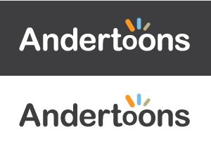
And the revisions start here.
I like this one since it keeps the flavor of the original, but I think it loses some of the whimsy too:
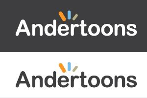
Here’s a take with “toons” made a bit more separate:
And here’s some ideas I think I’m scrapping almost right away.
This one almost almost made the cut, but… then it didn’t.
This one just doesn’t do anything for me:
Ad this one… I dunno, it’s like a cross between an airline and a feminine hygiene product:
So that’s it. At this point, I’m kinda leaning toward the original design with the lines over the different sized O’s.
Any thoughts? Suggestion?
Technorati Tags: andertoons, business, cartoon, cartooning, cartoonist, cartoons

