
So after getting my logo finished up, I decided I needed to update my stationary and business card too.
I’m using the same folks to to the design, but I’m not sure I like where it stands (click the image to enlarge):
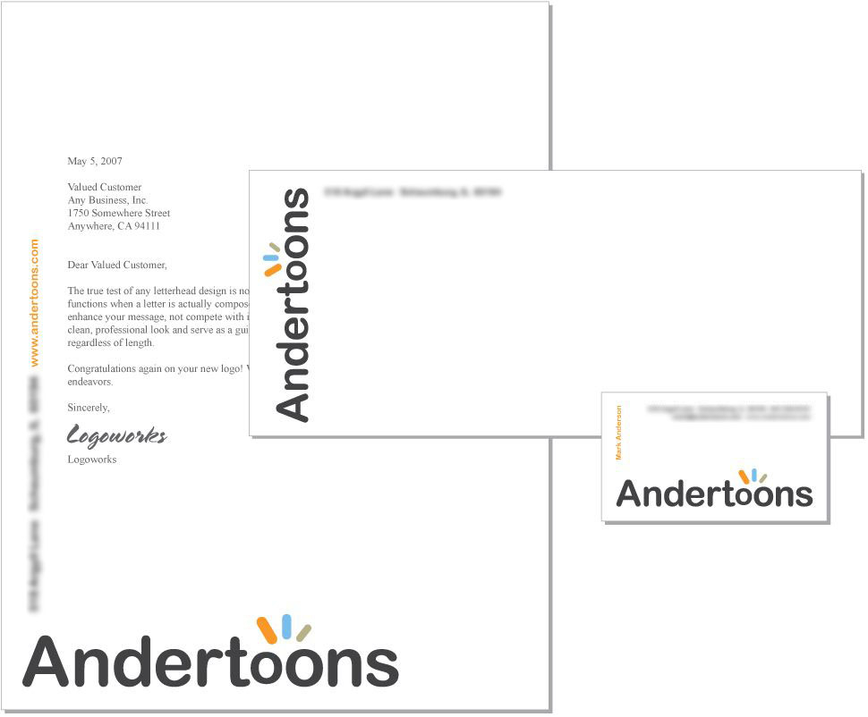
I’m thinking that “Andertoons” at the bottom of the paper is too large. And, as I said, I’m not sure I love this design at all really.
Any thoughts?
Oh, one more thing… I’ve considered putting a cartoon on the back of the business card. I was thinking this one. Probably redrawn.
Any other thoughts?
Now, any limericks?
Technorati Tags: andertoons, business, cards, cartooning, cartoonists, cartoons