Yesterday I had this very entry discussing my characters’ early lack of noses ready to go when, at about 6:00 AM or so, I thought I might do something a little more green for St. Patrick’s Day. I postponed the nose blog for Friday and didn’t give it another thought.
Imagine my surprise when yesterday’s Cathy-related posting over at Mark Heath’s Frog Blog popped up!
Here’s a quote:
Though Cathy lacks a nose, I wonder how many people notice? Cartoon faces can be very spare, but they’ll almost always need two things: eyes and a mouth… As long as the reader has eyes to connect with, and a mouth to study for emotional cues, the character is as real as a mirror-image.
How weird is that?! What are the odds of two cartoonists named Mark writing blogs about cartoons and their lack of noses on the very same day?!
Now I sort of wish I’d have left yesterday’s blog go out as scheduled.
Well, anyway, here it is:
I didn’t used to draw noses.
Obviously my style has evolved quite a bit in the years I’ve been drawing cartoons for a living, but I think the inclusion of noses have probably been the biggest single change.
I just could never get them to look quite right, and after some semi-regular sales, I just sort of figured it was part of what made my cartoons unique.
I’d draw them occasionally if I absolutely had to have people in profile, but they always look uncomfortable and out of place.
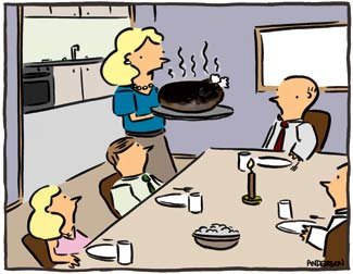
I picked out a couple of similar cartoons to illustrate the point, or the lack thereof. (You can click on each cartoon to see larger versions.)
EALRY NOSES
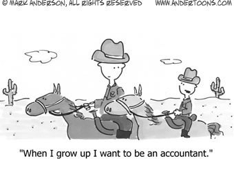
This is what I call the early nose or “no nose” version.


Not only is there no nose, but the mouth is contained entirely in the face and the head is basically just a simple circle. All in all, not that far removed from stick people.
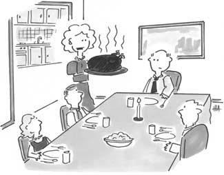
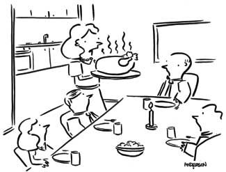
MIDDLE NOSES
Here’s my experimental or middle nose period.


The mouth has more of a Simpsons overbite vibe, and the head is looking more like a head, but the nose is even more awkward than simply leaving it off in the first place.
If you look closely, you can see the line for the nose is slightly thinner than the rest of the face. Definitely less confidence here.
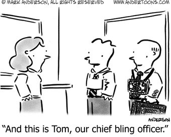
CURRENT NOSES
And here’s where we are today…


Although my mother has referred to them as looking too “wtichy,” I really like them. I think they add a nice angular touch to a more naturally rounded head and better looking mouth.
So why so long to draw decent noses, or even noses at all? Got me.
I do have a not insignificant schnozz, but I’ve never been that concerned about it.
I think it was one of those things I had trouble with and simply avoided as long as I could. But, in the end, I think I’ve hit my style right on the nose.