So this morning I was checking in on my blog to make sure that everything was posting OK when I noticed this:

It’s kind of hard to see, but the large cartoon shows a downward trending sales graph, and the smaller daily cartoon shows an upward trending sales graph. In the large cartoon a bald man is presenting, while in the smaller cartoon, a squiggly haired man presents.
Seeing the two cartoons together got me thinking; which character in my sales graph cartoons actually performed the best according to the data he or she was presenting.
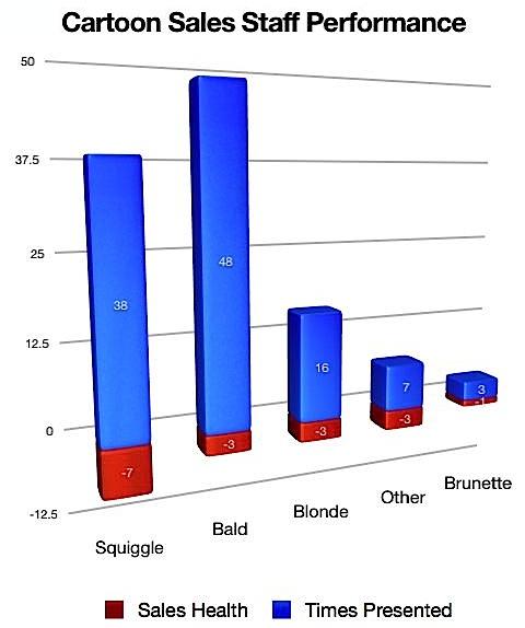
So I took my 112 sales graph cartoons and created a spreadsheet. Every time the character presenting was giving good news they got a 1. Every time they were giving bad news they got a -1. And if the news was neither, a 0.
Here are the results as (what else?!) a graph:

Turns out if I assume that the person giving the presentation is responsible for the data presented, my characters are not gifted businesspeople.
The Squiggle-haired Man is probably the character most associated with my style, and he’s apparently a poor businessman indeed. After giving just under a third of all presentations, he scored by far the worst.
When you consider the Bald Man presented the most often and only ended up with a negative three for his performance, he did well for his peers.
The Blonde Woman presented less often and tied the Bald Man for performance. She’s one to watch.
The Brunette Woman presented only three times, so her negative one doesn’t really tell us much.
The Other presenters included a bee, a cow, a leprechaun, Frankenstein, a bird, a baby, and Robin Hood. Not bad as a group when you consider they’re either extremely young, fictional, or anthropomorphic.
So there it is. It’s disappointing, but I guess it’s better to know.
The good news is that cartoons about bad sales tend to sell well. So I guess I’ll keep ’em all around.

