
OK, I asked for a revision on the last concept, just to see some other options, and here’s what I got back (click on the image to enlarge it):
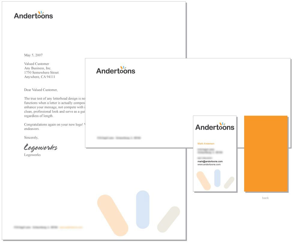
Here’s the one before the revision (again, click to enlarge):
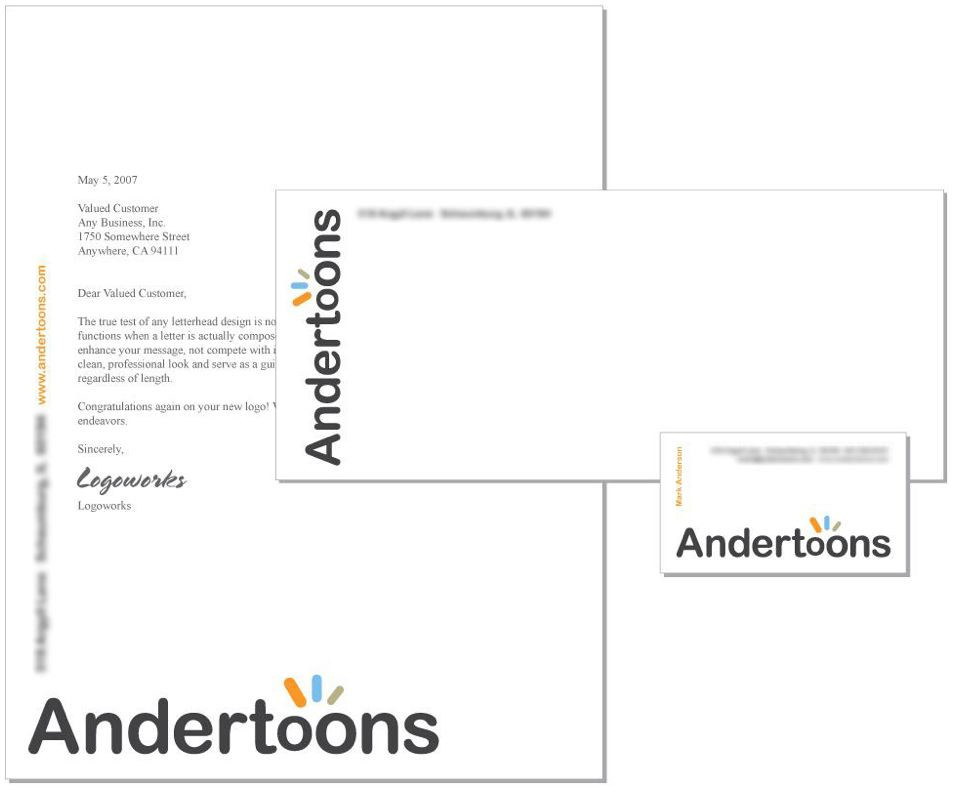
So Im thinking the bottom one (AKA the original concept) with a cartoon on the back of the card. Whatcha think?
Technorati Tags: andertoons, business, cards, cartoon, cartooning, cartoonist, cartoons
It doesn't say "CARTOONIST" to me.
I have to agree with you, Mark – the top one appears too formal and without wit to me. However, it would be just right for a Danish furniture store!
Huh? I thought these were cool. I mean, they're just a logical extension of the previous designs. I liked 'em. They're not as cool as the Primatech Paper logo, but what could be?!
http://www.primatechpaper.com/
Oh, and thank you for not doing the "cartoonist shackled to his drawing board" drawing on any of these previous previews.
I vote for the original, bottom design too.
Mark, I like the new designs better. I've no problem with previous designs except with the logo on the letter head. It does say 'cartoonist', but it says a bit loud.
Gotta go with the second one, it feels more fun and colorful. I think you should definitely put a cartoon on there too. People would remember a cartoon better than any well designed stationary.
On the contrary. Mark can't put that cartoon on his stationary, because he's going to give it to me to put on my stationary!
I like u'r art work. so nice.