Jim Borgman had a fascinating entry a few days ago about using ethnic characters in cartoons to acknowledge diversity, but…
“…racial images are so charged in our times that it is harder than you’d think…”
Got that right.
I’ve thought about this off and on over the years. And when I do custom cartoons (normally in color), especially for large corporate clients, I think I do a much better job of this, but my bread and butter grayscale gag work? Not so much.
(OK, before we continue, I’m really going to try to wade very carefully in these waters. I don’t want to offend anyone, but I also want to speak frankly, so everyone take a deep breath…)
The town we live in is very diverse. I’m proud that when I take my son to the library, he sees and hears all colors, nationalities, languages, religions etc… I hope that my kids see the world a little less lilly white than I did with my cornfed upbringing.
So why don’t I draw more ethnicities?
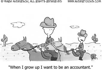
I tell myself that my little people aren’t white, they’re generic. It’s kind of a cop out.
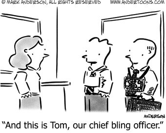
Here’s the thing – if I draw a standard conference table sort of scene with four people, and I make one a medium gray color, I’m worried about tokenism.
OK, so add two ethnic characters. One light gray, and one a medium gray. For some reason, and maybe it’s me overanalyzing it, but it slows down the read of the cartoon. All of a sudden it’s not people at a table, it’s two whites, a hispanic, and a black at a table.
And where do you seat them? Who’s in charge of the meeting? What about sex – how many women are enough? Should the female character display ethnicities too? Should anyone be wearing, say, a turban?
OK, so let’s not worry about color per se, how about ethnically distinct facial features? Would it be enough to add slightly larger lips to imply color? Or a more Asian eye?
The problem here is that my characters are very simply drawn. Honestly, there’s only three, maybe four lines defining the face. Plus, truth be told, I’m no great artist. Ethnic features drawn by me would almost certainly look clumsy or caricaturistic and call attention to themselves, again, slowing down the read of the cartoon.
Ugh… I don’t know the answer to this, and truth be told, running a business while juggling the kids leaves me little time for meditation on the subject. But I think the fact that I worry about this says an awful lot about how our society hasn’t progressed very far along these lines at all.
Which is pretty sad.
Technorati Tags: andertoons, cartooning, cartoonists, cartoons


 So
So  I ran across
