Part of being a cartoonist is drawing holiday cartoons during the Spring and/or Summer months.
Generally magazines, greeting cards and such are working at least 6 months ahead if not more, so I get to ponder jokes about Santa Claus while I’m getting the grill ready to go for the season.
It’s weird, but you get used to it.
Recently I’ve been selling more and more greeting cards, and unlike most of my gag markets, they require color. I normally re-ink the cartoon from scratch rather than trying to remove my gray shading in Photoshop. I find it comes out a lot cleaner.
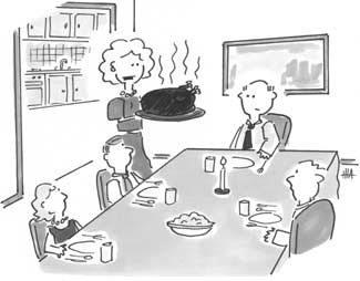
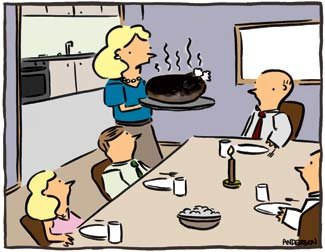
Anyway, a card company bought some of my older Thanksgiving stuff and I ran into sort of a weird little problem. Here’s the original art as I submitted it:
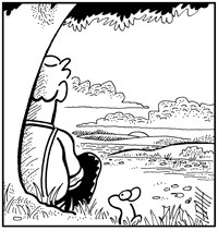
(You can go here for the gag…)
This one is from much earlier in my cartooning career before my current style had set in.
Note the lack of noses on some characters, and the awkward nose experimentation on the others. The whole thing is kinda on a goofy angle too. And why I chose to cut the door on the left at that conspicuous angle I don’t quite know.
Anyway, here’s the problem: The greeting card company liked the cartoon and bought it, but I don’t draw that way anymore. Do I redraw it in my current style, or redo what I’d done before, even though I’m not happy with the art?
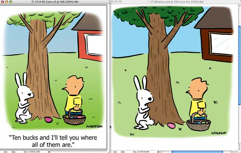
In the end I decided to keep the same angles and basic composition, but updated the characters and line to my current style. Here’s the line art:
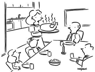
And here it is in color:
Not bad in the end, but it does make you rethink sending out older art. Sure it’s salable, but do I want the hassle?
I know some cartoonists go back and redo older cartoons in their current styles, but, honestly, once I’m done with a cartoon I don’t even like revisiting it to color it for a paying client.
Anyway, here’s hoping they like the final product…
See some thanksgiving cartoons at Andertoons…
Technorati Tags: andertoons, cartoons